

▶ Table of Contents
- Introduction: The Hidden Sales Driver Most Businesses Overlook
- What Is a “Simple Menu” (and Why It Works)
- The Psychology Behind Simple Menus and Better Decisions
- Data-Driven Insights: The Real Impact on Sales
- Practical Tips: How to Simplify Your Menu for More Sales
- Conclusion: Simplicity Isn’t Minimalism—It’s Strategy
Introduction: The Hidden Sales Driver Most Businesses Overlook
When businesses think about increasing sales, they often focus on ads, pricing, or product features. But one of the most powerful conversion tools is often hiding in plain sight: your menu.
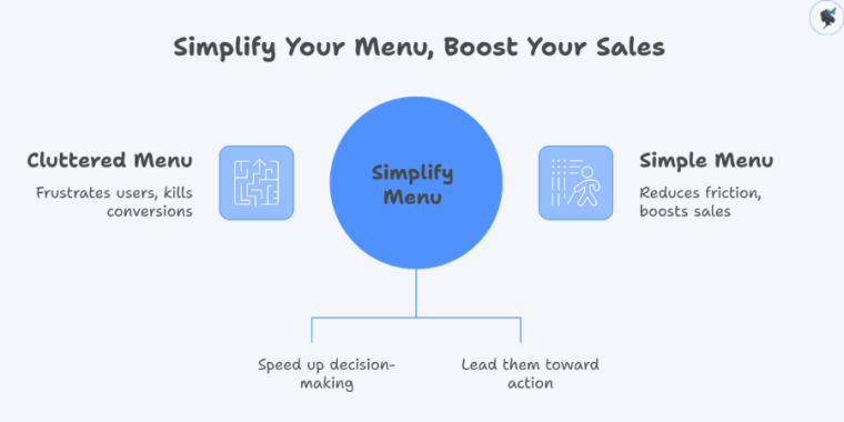
A cluttered, confusing menu doesn’t just frustrate users—it quietly kills conversions. On the flip side, a simple, well-structured menu reduces friction, speeds up decision-making, and guides users toward taking action.
In 2026, where users are more impatient and selective than ever, clarity isn’t optional—it’s a competitive advantage. Conversion Rate Optimization (CRO) has evolved into a core growth discipline, with successful brands focusing on removing friction and making decisions easier for users.
This article breaks down why simple menus work, the psychology behind them, and how you can use them to boost your sales.
What Is a “Simple Menu” (and Why It Works)
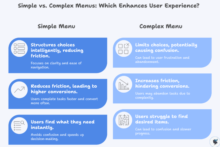
A simple menu isn’t about limiting choices—it’s about structuring them intelligently.
Key Characteristics of a Simple Menu
- Clear, familiar labels (e.g., “Shop,” “Pricing,” “Contact”)
- 5–7 primary navigation options
- Logical grouping of related items
- Consistent layout across pages
- Mobile-friendly, thumb-accessible design
Why Simplicity Drives Conversions
At its core, simplicity reduces friction—the biggest enemy of conversions.
Modern UX research consistently shows that:
- Users want speed, simplicity, and ease of navigation, especially on mobile
- Interfaces that reduce friction help users complete tasks faster and convert more often
In fact, improving mobile UX alone can increase conversions by 28% and retention by 15%.
A simple menu helps users:
- Find what they need instantly
- Avoid confusion
- Move quickly toward purchase decisions
And in digital environments, speed equals revenue.
The Psychology Behind Simple Menus and Better Decisions
A simple menu works because it aligns with how the human brain processes information.
Hick’s Law: Fewer Choices = Faster Decisions
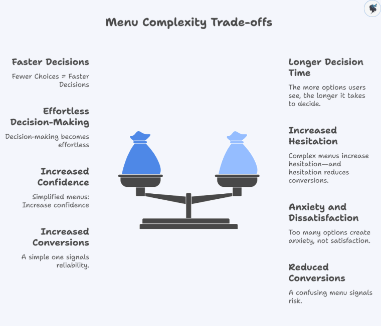
The more options users see, the longer it takes to decide.
Complex menus increase hesitation—and hesitation reduces conversions.
Cognitive Load: Don’t Make Users Think
Users have limited mental energy. Every extra menu item adds effort.
When navigation is intuitive:
- Users feel in control
- Decision-making becomes effortless
- Conversion becomes more likely
The Paradox of Choice
Too many options create anxiety, not satisfaction.
Simplified menus:
- Increase confidence
- Reduce abandonment
- Encourage action
Clarity Builds Trust
Users associate clean, structured interfaces with professionalism.
And trust directly impacts conversions:
- Over 60% of users won’t return after a poor experience
A confusing menu signals risk. A simple one signals reliability.
Data-Driven Insights: The Real Impact on Sales
The connection between simple navigation and revenue isn’t theoretical—it’s measurable.
UX Directly Drives Conversion Rates
Well-designed UI can increase conversions by up to 200%.
Strong UX improvements can boost conversions by up to 400%.
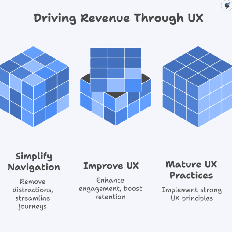
These gains often come from simplifying user journeys—including navigation.
Removing Navigation Can Double Conversions
In a well-known case study:
Removing a website menu increased conversions from 3% to 6% (a 100% lift)
Why? Because fewer options = fewer distractions.
Intuitive Navigation Increases Engagement and Retention
Research shows that:
Intuitive navigation and UX design significantly improve engagement and conversion rates.
Users stay longer, explore more, and are more likely to buy.
UX Maturity = Revenue Growth
Companies with strong UX practices see:
- 2.1x higher revenue growth
- 1.9x higher profitability
Menu simplicity is a foundational part of that UX maturity.
Practical Tips: How to Simplify Your Menu for More Sales
You don’t need a full redesign to see results. Small, strategic changes can have a big impact.
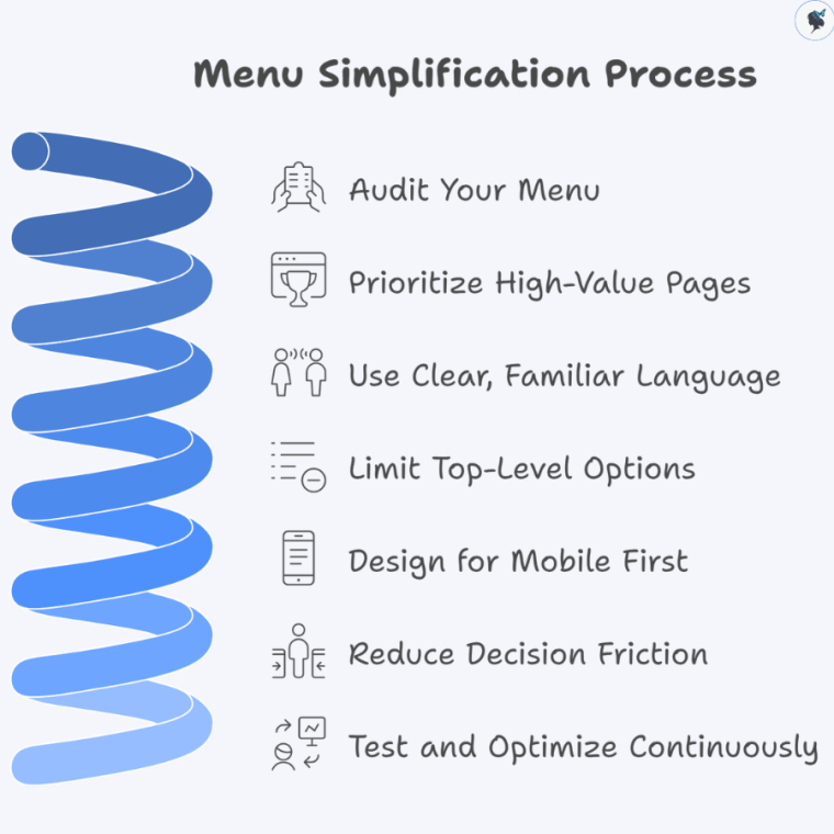
1. Audit Your Menu
- Identify low-click or redundant items
- Use analytics to see what users actually use
Wander Women Hot Tip: If it’s not helping conversions, remove it.
2. Prioritize High-Value Pages
Your menu should guide users toward:
- Products or services
- Pricing pages
- Contact or checkout
Everything else is secondary.
3. Use Clear, Familiar Language
Avoid clever or branded terms.
Instead of:
- “Solutions” say “Services”
- “Explore” say “Shop”
Clarity always beats creativity in navigation.
4. Limit Top-Level Options
Stick to 5–7 main items.
If you have more:
- Group them into dropdowns
- Use structured layouts (not cluttered mega menus unless necessary)
5. Design for Mobile First
Mobile users demand simplicity:
- Use thumb-friendly navigation
- Keep key actions visible
- Avoid deep, complex menu layers
Mobile-first simplicity improves performance across all devices.
6. Reduce Decision Friction
Ask yourself:
“Can a user find what they need in under 3 seconds?”
If not, simplify.
7. Test and Optimize Continuously
- Run A/B tests on menu structures
- Track:
- Click-through rates
- Bounce rates
- Conversion rates
Even small tweaks can unlock major gains.
Conclusion: Simplicity Isn’t Minimalism—It’s Strategy
A simple menu isn’t just a design choice—it’s a revenue strategy.
By reducing cognitive load, guiding user behavior, and eliminating friction, simple menus:
- Speed up decision-making
- Increase trust
- Improve user experience
- Drive measurable conversion growth
In a digital landscape where attention is limited and competition is high, the businesses that win aren’t the ones offering more—they’re the ones making decisions easier.
Start with your menu. Simplify it. Test it. Optimize it.
Because sometimes, the fastest way to increase sales… is to remove options.
Need help? Contact us today!
Discover more from Wander Women Strategies
Subscribe to get the latest posts sent to your email.
