▶ Table of Contents
If your website serves local customers, sells products, generates leads, or supports appointments, mobile navigation is no longer a secondary consideration. For many businesses, it is the primary way customers interact with the brand online.
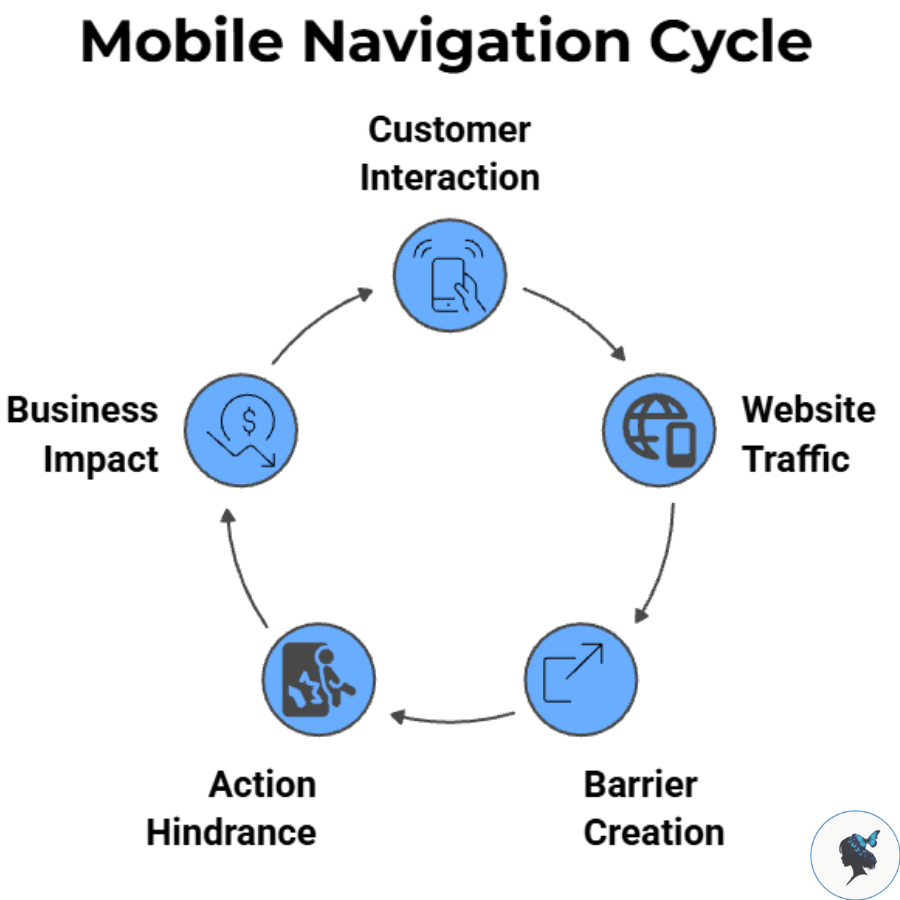
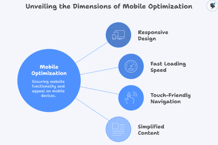
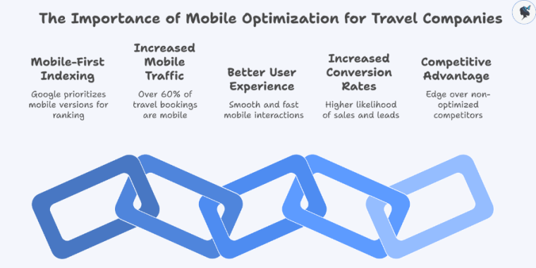
Recent data shows that mobile devices continue to account for the majority of global web traffic, with mobile usage consistently exceeding desktop traffic worldwide. Depending on the dataset and reporting period, mobile devices now generate roughly 52–64% of website traffic globally, reinforcing the need for mobile-first website experiences.
For small businesses, poor navigation can create barriers between visitors and key actions such as:
- Booking an appointment
- Requesting a quote
- Calling the business
- Finding a location
- Making a purchase
- Contacting customer support
The easier these actions are to complete, the more likely visitors are to become customers.
Principles of Effective Mobile Navigation
Keep It Simple
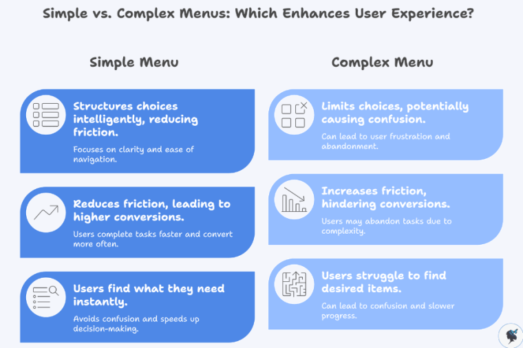
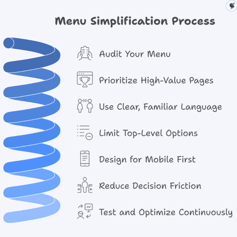
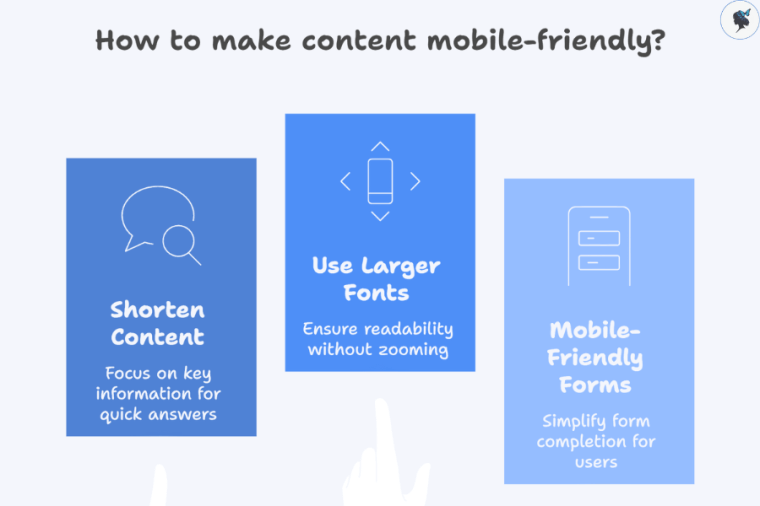
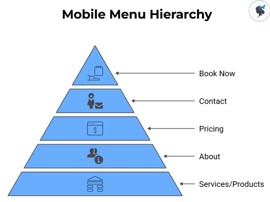
One of the most common mistakes businesses make is trying to place everything in the main menu.
Instead, prioritize the pages customers use most often.
A typical small business mobile menu might include:
- Services or Products
- About
- Pricing
- Contact
- Book Now
If a page receives little traffic or serves a niche audience, consider moving it deeper into the site structure.
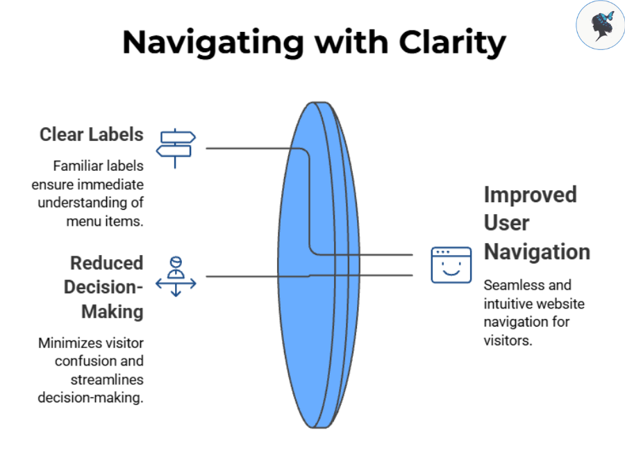
Use Familiar Labels
Visitors should immediately understand where each menu item leads.
Clear labels such as:
- Services
- Pricing
- Contact
- Locations
- FAQs
usually perform better than creative alternatives that require interpretation.
Navigation should reduce decision-making, not increase it.
More about navigation mistakes here.
Prioritize Customer Goals
Business owners often organize menus around internal departments or company structure.
Customers think differently.
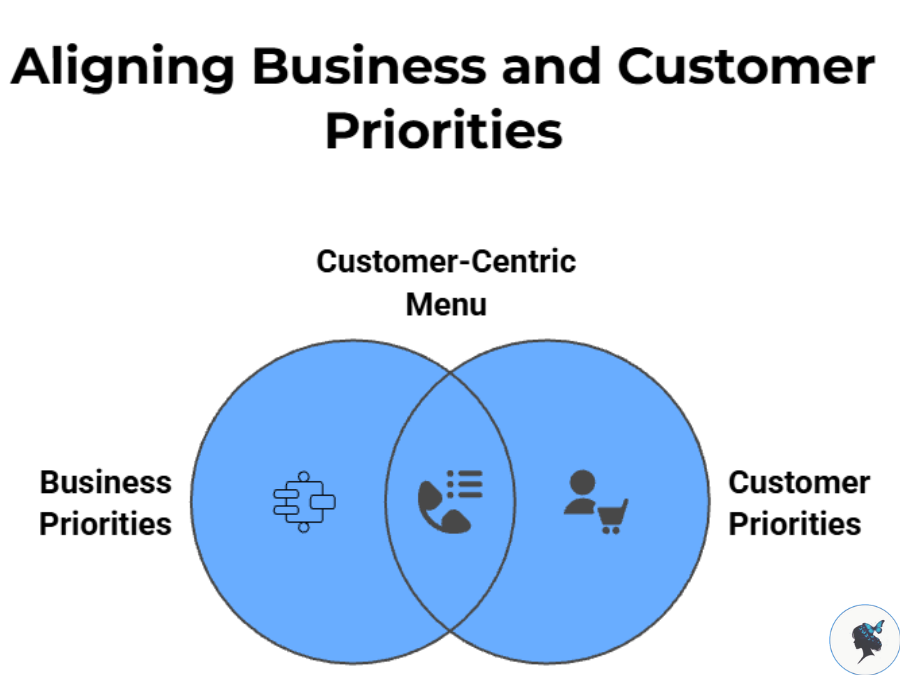
A homeowner searching for a plumber wants service information and contact details. A restaurant customer wants menus, reservations, and hours. An online shopper wants categories and checkout access.
The menu should reflect customer priorities first.
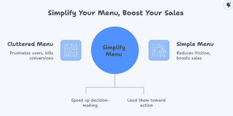
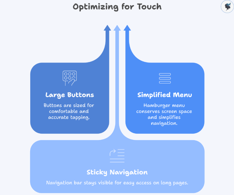
Make Important Actions Easy to Reach
Your most valuable actions should never be hidden.
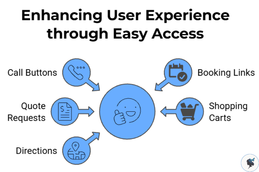
Consider highlighting:
- Call buttons
- Booking links
- Quote requests
- Shopping carts
- Directions
A good rule of thumb is that users should be able to reach key actions within one or two taps.
More about simplifying your menu here.
Common Mobile Navigation Mistakes
Too Many Menu Items
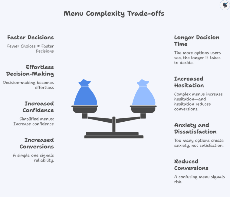
Long menus increase cognitive load and make decisions harder.
If visitors must scroll extensively through navigation options, it may be time to simplify.
Deep Menu Structures
Multi-level navigation can work for large websites, but excessive nesting often frustrates mobile users.
Whenever possible:
- Limit menu depth
- Group related content logically
- Keep pathways short
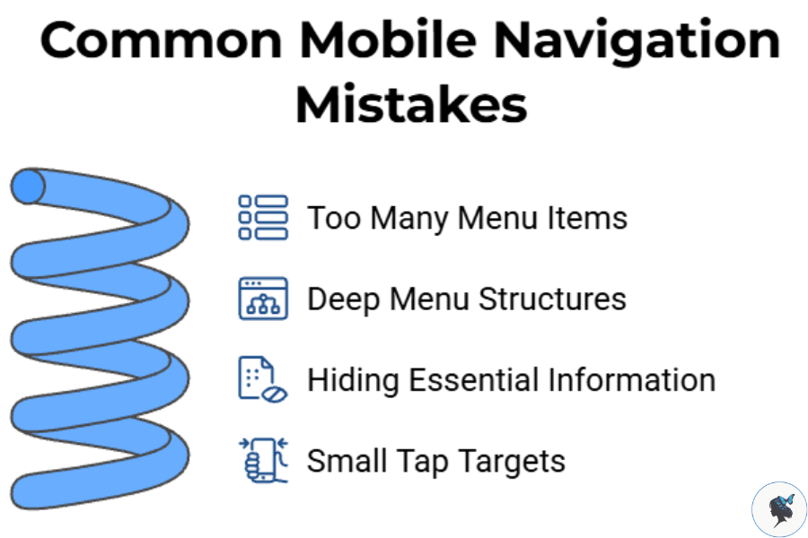
Hiding Essential Information
Many businesses unintentionally bury information customers need most.
Common examples include:
- Business hours
- Contact information
- Pricing
- Service areas
- Reservation options
If customers frequently call to ask basic questions, your navigation may need improvement.
Small Tap Targets
Mobile navigation should be designed for thumbs, not mouse pointers.
Buttons and menu items that are difficult to tap can create friction and lead to abandoned visits.
Practical Ways to Improve Your Mobile Menu
Review Your Analytics
Before redesigning navigation, identify:
- Most-visited pages
- Most common conversion paths
- Highest-performing content
Your menu should support actual customer behavior rather than assumptions.
More about using data to improve user experience here.
Test With Real Users
Ask a few customers, employees, or friends to complete common tasks on their phones.
Examples:
- Find your contact information
- Request a quote
- Locate a service page
- Complete a purchase
Observe where they hesitate.
These moments often reveal navigation problems faster than analytics alone.
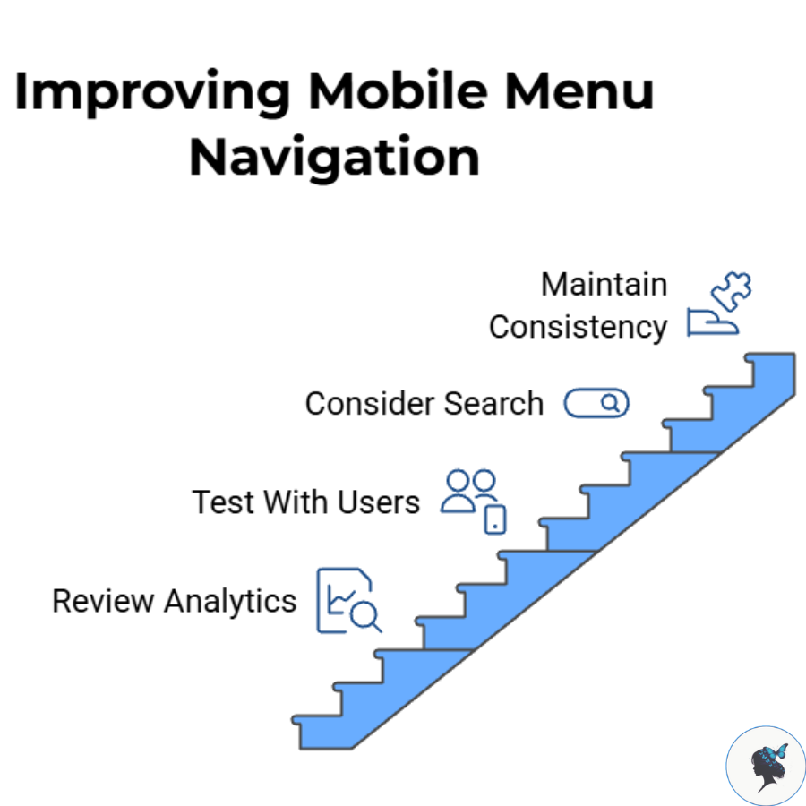
Consider Search for Larger Sites
If your website contains:
- Large product catalogs
- Extensive service offerings
- Resource libraries
adding search functionality may improve navigation efficiency.
Maintain Consistency
Menu placement, labels, and navigation behavior should remain consistent throughout the website.
Consistency reduces learning effort and helps visitors feel confident as they browse.
Examples of Effective Mobile Navigation
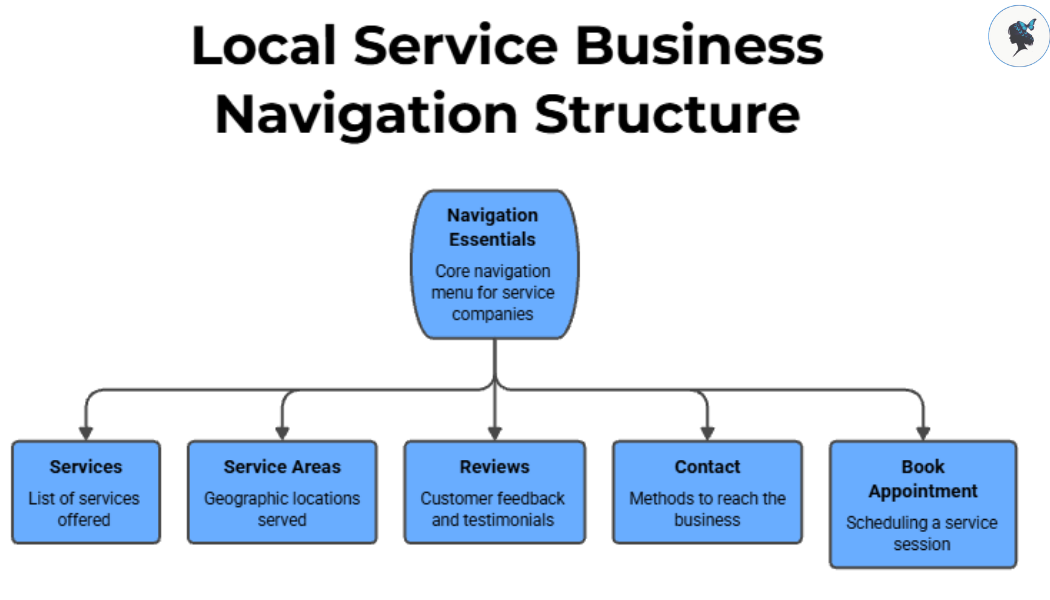
Local Service Businesses
Many successful service companies keep navigation focused on a few essentials:
- Services
- Service Areas
- Reviews
- Contact
- Book Appointment
This approach aligns with what most customers need immediately.
Restaurant Websites
Strong restaurant mobile experiences often emphasize:
- Menu
- Reservations
- Hours
- Location
Visitors can quickly find information without navigating multiple layers.
Small E-commerce Stores
Successful online retailers typically make these elements highly visible:
- Product Categories
- Search
- Cart
- Customer Support
Reducing friction during shopping helps customers move more efficiently toward purchase.
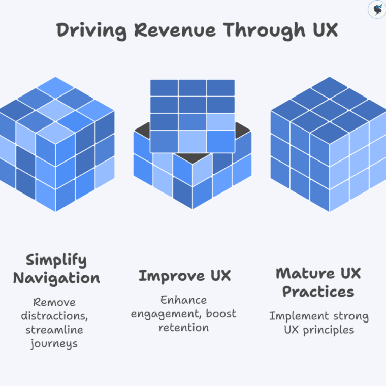
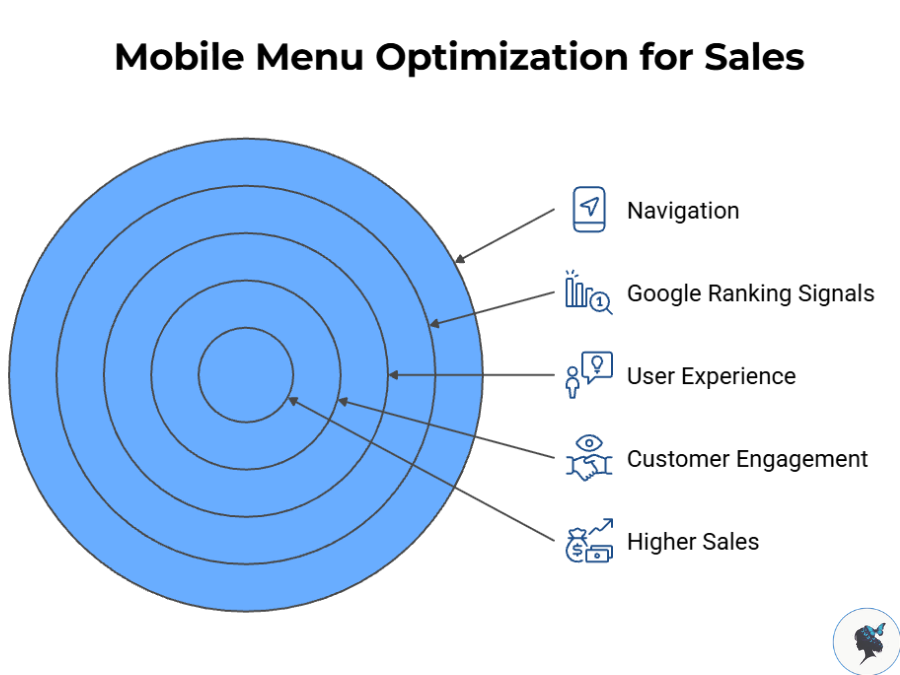
The Business Impact of Better Navigation
While navigation alone will not guarantee higher sales, it can remove obstacles that prevent customers from taking action.
Mobile users increasingly expect fast, intuitive experiences. At the same time, Google continues to emphasize user experience signals through initiatives such as mobile-first indexing and Core Web Vitals, which focus on performance and usability. While content remains the primary ranking factor, usability improvements often support stronger engagement and business outcomes.
For small businesses, the goal is not to create the most sophisticated menu. The goal is to create the clearest path between a visitor and the action you want them to take.
A simple, customer-focused mobile menu can help visitors find what they need faster, improve their experience, and increase the likelihood that they become paying customers.