
▶ Table of Contents
- Why Website Navigation Matters (Especially for Small Businesses)
- Your 30-Minute Navigation Audit Plan
- Step 1: Quick First Impression Check (5 Minutes)
- Step 2: Review Your Navigation Structure (10 Minutes)
- Step 3: Check Mobile Navigation (10 Minutes)
- Step 4: Check Speed & Performance (5 Minutes)
- Step 5: Look at Real User Behavior (5 Minutes)
- Your 30-Minute Navigation Audit Checklist
- Common Navigation Mistakes Small Businesses Make
- Conclusion: Small Fixes, Big Results
If your website isn’t converting visitors into customers, your navigation might be the silent culprit.
Think about it: when someone lands on your site, they’re usually looking for something specific—your services, pricing, contact info. If they can’t find it quickly, they leave. No second chances.
The good news? You don’t need a full redesign to fix this.
In just 30 minutes, you can audit your website navigation and uncover simple improvements that make a big difference in user experience—and conversions.
Let’s walk through it step by step.
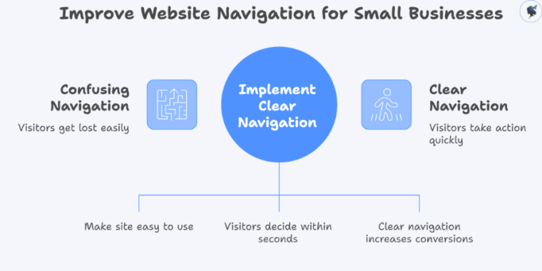
Why Website Navigation Matters (Especially for Small Businesses)
Your navigation acts like a map. If it’s confusing, people get lost. If it’s clear, they take action.
For small businesses, this is critical because:
- You often have fewer chances to win a customer
- Visitors are more likely to compare you with competitors quickly
- Every click (or missed click) affects your bottom line
- Users decide within 10–20 seconds whether your site is easy to use
- Clear navigation can increase conversions by up to 30%
So let’s fix yours—fast.
Your 30-Minute Navigation Audit Plan
Here’s how to break it down:
- 0–5 minutes: First impression check
- 5–15 minutes: Navigation structure review
- 15–25 minutes: Mobile + usability check
- 25–30 minutes: Analytics + quick fixes
Set a timer. Let’s go.
Step 1: Quick First Impression Check (5 Minutes)
Open your website like a new visitor would.
Ask yourself:
- Can I instantly tell what this business does?
- Is the menu easy to understand at a glance?
- Do I know where to click next?
What to Look For
- Too many menu items (overwhelming)
- Confusing labels like “Solutions” or “Resources”
- Important pages buried or missing
Quick Wins
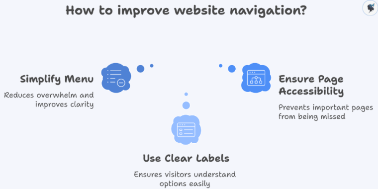
- Limit your main menu to 5–7 items
- Use clear, simple labels:
- “Services”
- “Pricing”
- “Contact”
- “
What We Do”
Example: A local cleaning business increased inquiries just by changing “Solutions” to “Home Cleaning Services”.
More about simple menus here.
Step 2: Review Your Navigation Structure (10 Minutes)
Now click through your site like a customer.
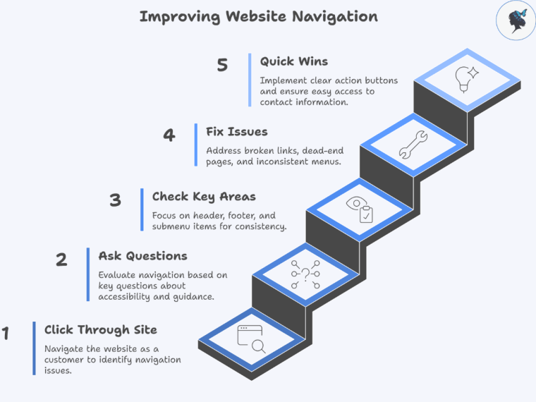
Ask These Questions
- Can I reach key pages in 3 clicks or less?
- Does every page guide me to a next step?
- Is the menu consistent across all pages?
Check These Key Areas
- Header menu (top navigation)
- Footer links (often overlooked but important)
- Any dropdown or submenu items
Common Issues to Fix
- Broken links
- Dead-end pages (no call-to-action)
- Inconsistent menus between pages
Quick Wins
- Add a clear call to action (CTA) button like:
- “Book Now”
- “Get a Quote”
- “Call Us”
- Make sure your Contact page is easy to find
2026 Insight: HubSpot’s latest UX reports show that clear navigation paths can increase conversions.
More about the importance of clear CTAs here.
Step 3: Check Mobile Navigation (10 Minutes)
More than half your visitors are likely on mobile—this step is crucial.
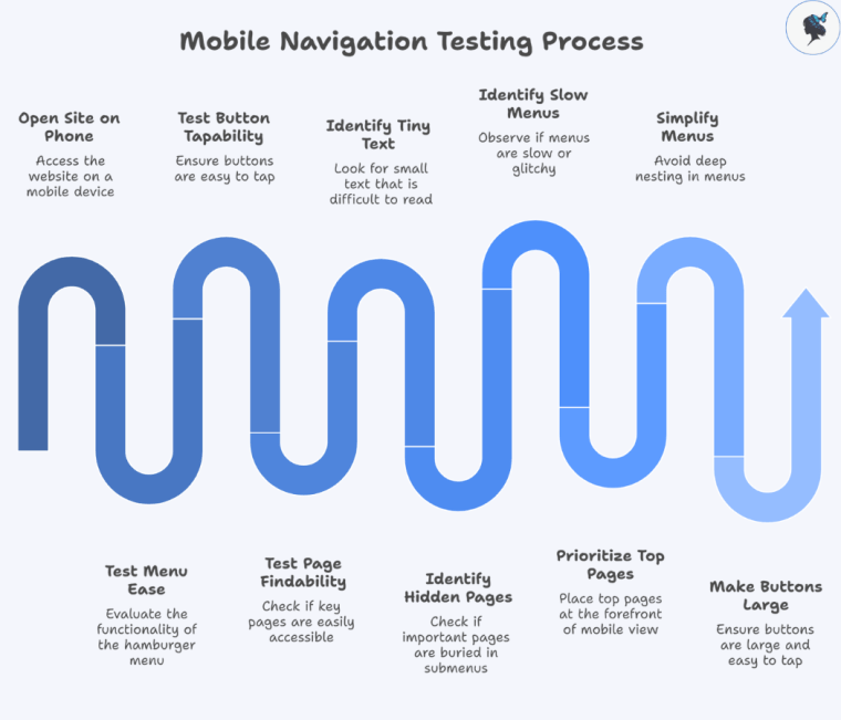
Grab your phone and open your site.
What to Test
- Is the menu easy to open (hamburger menu)?
- Are buttons easy to tap?
- Can you find key pages quickly?
Watch Out For
- Tiny text or buttons
- Important pages hidden in submenus
- Menus that are slow or glitchy
Quick Fixes
- Prioritize your top 3–4 pages in mobile view
- Keep menus simple—avoid deep nesting
- Make buttons large and easy to tap
2026 Trend: Google now prioritizes mobile-first indexing, meaning your mobile experience directly impacts your rankings.
More about mobile optimization here.
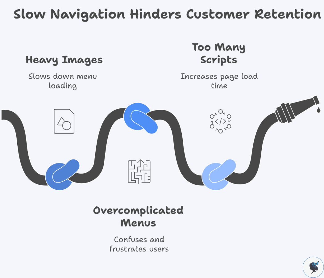
Step 4: Check Speed & Performance (5 Minutes)
Slow navigation = lost customers.
Use a Free Tool
- Google PageSpeed Insights
What to Look For
- Does your menu load instantly?
- Do dropdowns open smoothly?
Common Problems
- Heavy images in menus
- Overcomplicated mega menus
- Too many scripts running
Quick Wins
- Simplify your menu design
- Remove unnecessary animations
- Avoid cluttered dropdowns
2026 Insight: Navigation delays of even 1 second can significantly increase drop-offs.
Step 5: Look at Real User Behavior (5 Minutes)
Now let’s see what your visitors are actually doing.
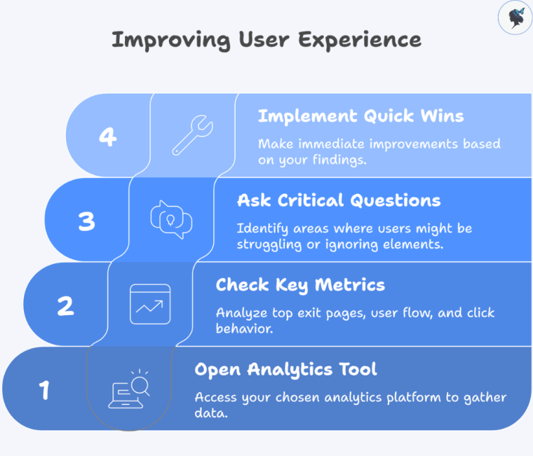
Open Your Analytics Tool
Check
- Top exit pages (where people leave)
- User flow (how they move through your site)
- Click behavior (what they actually use)
Ask
- Are users ignoring your menu?
- Are they getting stuck somewhere?
Quick Wins
- Move popular pages into your main menu
- Remove links no one clicks
- Highlight high-converting pages
2026 Insight: Behavior-based navigation optimization is one of the top CRO (conversion rate optimization) trends this year.
Your 30-Minute Navigation Audit Checklist
Use this before you finish:
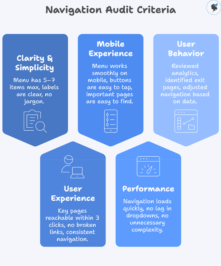
Clarity & Simplicity
- Menu has 5–7 items max
- Labels are clear and easy to understand
- No jargon or vague terms
User Experience
- Key pages reachable within 3 clicks
- No broken links
- Navigation is consistent across pages
Mobile Experience
- Menu works smoothly on mobile
- Buttons are easy to tap
- Important pages are easy to find
Performance
- Navigation loads quickly
- No lag in dropdowns
- No unnecessary complexity
User Behavior
- Reviewed analytics (GA4 or similar)
- Identified top exit pages
- Adjusted navigation based on real data
Common Navigation Mistakes Small Businesses Make
Avoid these:
- Too many menu options (decision overload)
- Trying to sound “clever” instead of clear
- Hiding important pages (like pricing or contact)
- Ignoring mobile users
- Never reviewing analytics
Real Example: In real-world CRO case studies, simplifying website navigation has led to significant performance gains. For example, one B2B company saw a 200% increase in conversions after restructuring and testing its navigation.
Conclusion: Small Fixes, Big Results
You don’t need a full website redesign to improve your results.
Sometimes, all it takes is:
- Clearer labels
- Simpler structure
- Better mobile experience
And the best part? You can start right now.
Your Next Step
Set a 30-minute timer and run this audit on your website today.
Even a few small changes could mean:
- More clicks
- More inquiries
- More customers
Need help? Contact us today!
