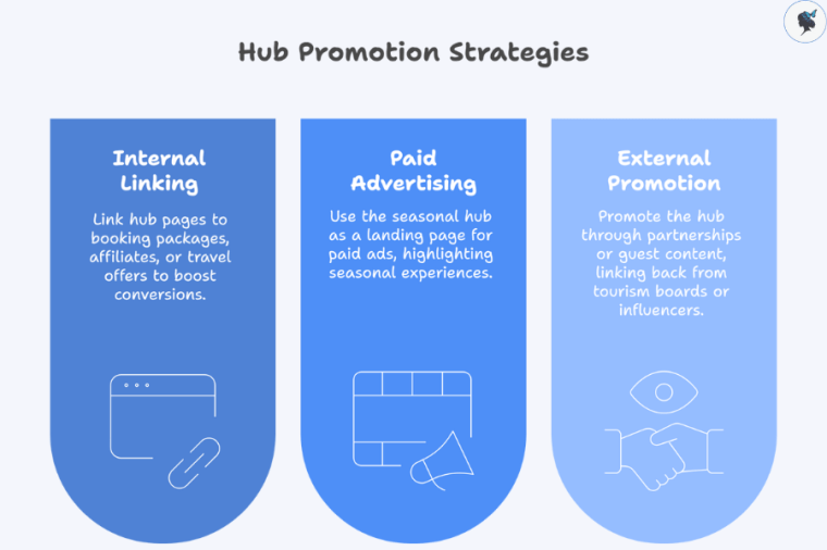
Mobile Navigation Best Practices for Small Businesses

▶ Table of Contents

If your website serves local customers, sells products, generates leads, or supports appointments, mobile navigation is no longer a secondary consideration. For many businesses, it is the primary way customers interact with the brand online.

infograph: Mobile navigation cycle
Mobile navigation cycle

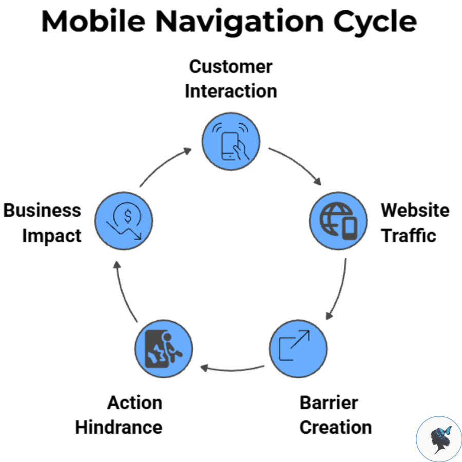
Recent data shows that mobile devices continue to account for the majority of global web traffic, with mobile usage consistently exceeding desktop traffic worldwide. Depending on the dataset and reporting period, mobile devices now generate roughly 52–64% of website traffic globally, reinforcing the need for mobile-first website experiences.

For small businesses, poor navigation can create barriers between visitors and key actions such as:

  • Booking an appointment
  • Requesting a quote
  • Calling the business
  • Finding a location
  • Making a purchase
  • Contacting customer support

The easier these actions are to complete, the more likely visitors are to become customers.

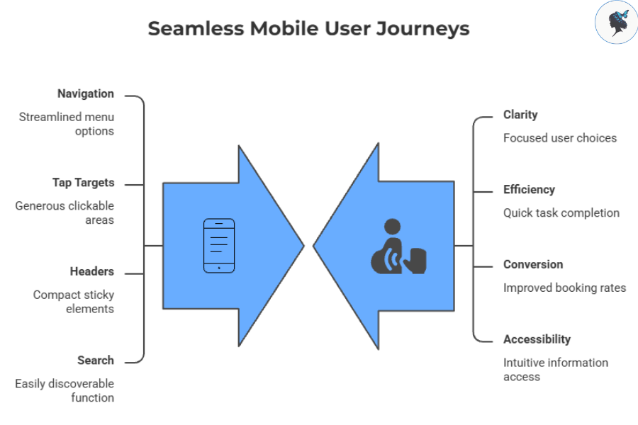
Principles of Effective Mobile Navigation
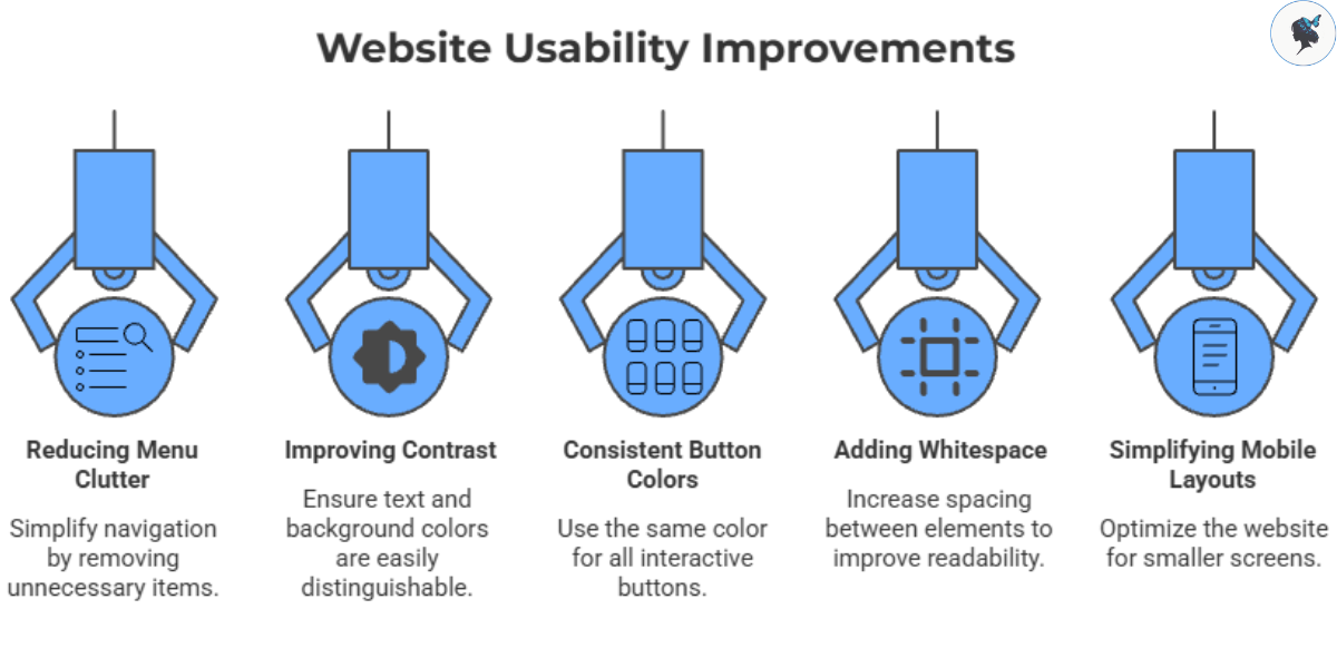
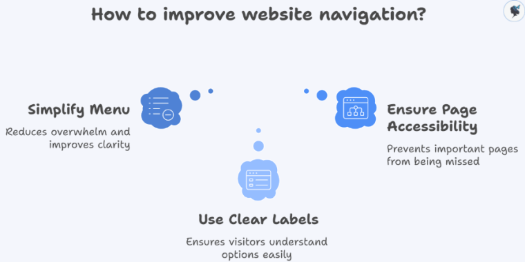
Keep It Simple

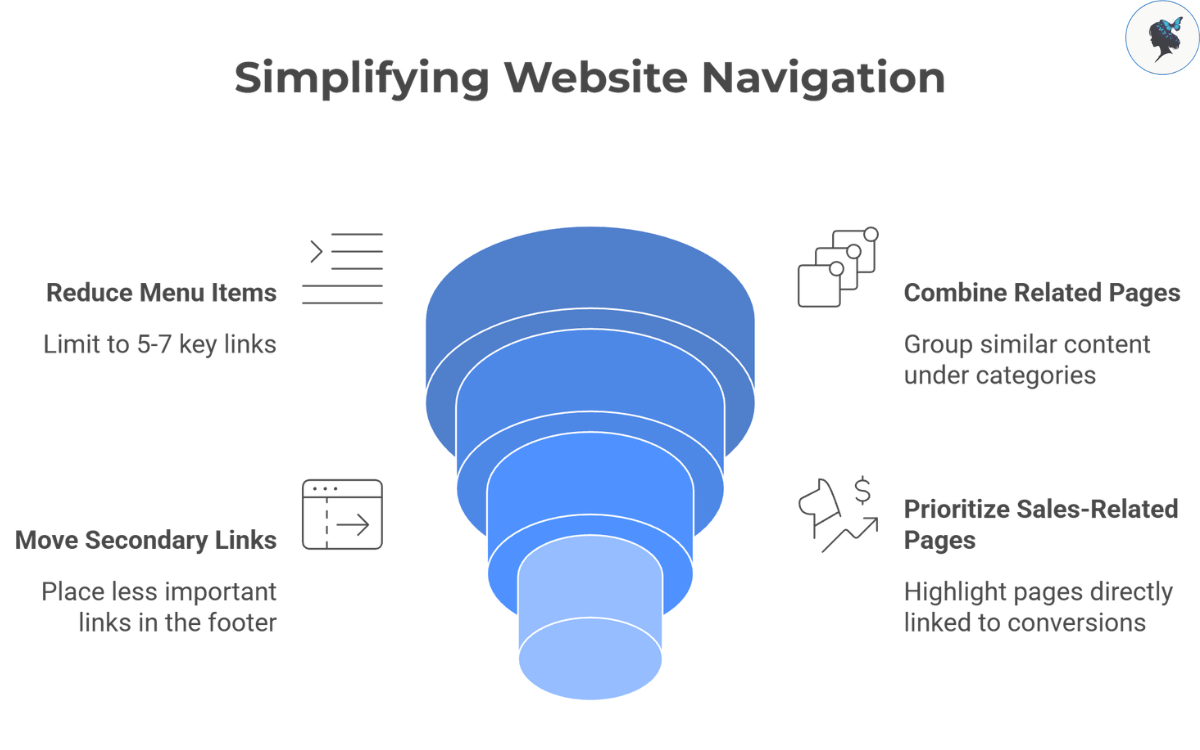
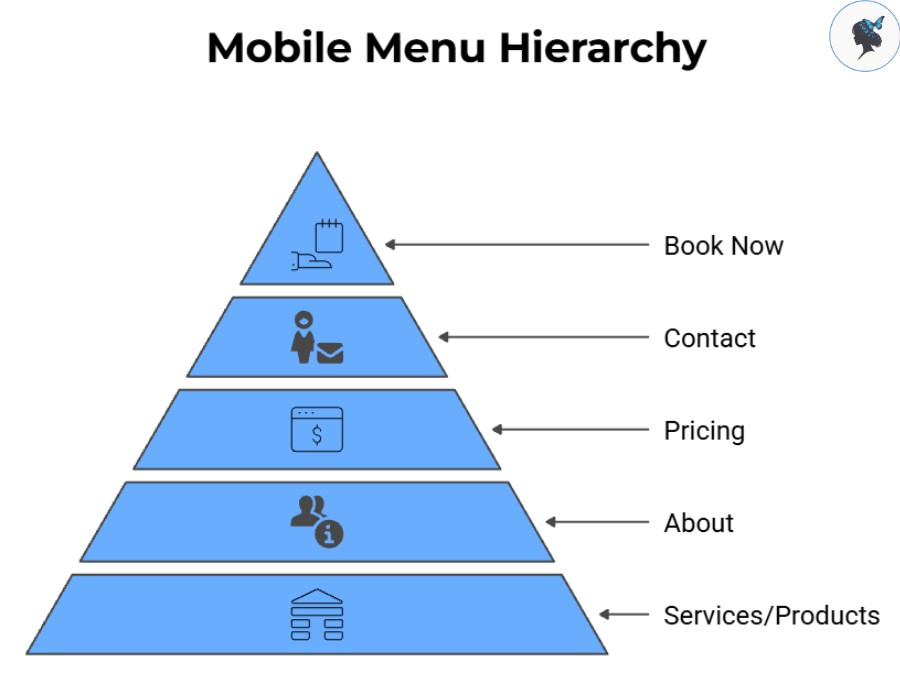
One of the most common mistakes businesses make is trying to place everything in the main menu.

Instead, prioritize the pages customers use most often.

infograph: Navigating with clarity
Navigating with clarity

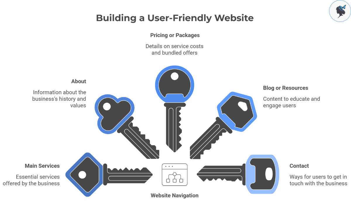
A typical small business mobile menu might include:

  • Services or Products
  • About
  • Pricing
  • Contact
  • Book Now

If a page receives little traffic or serves a niche audience, consider moving it deeper into the site structure.
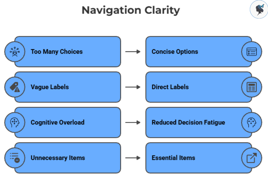
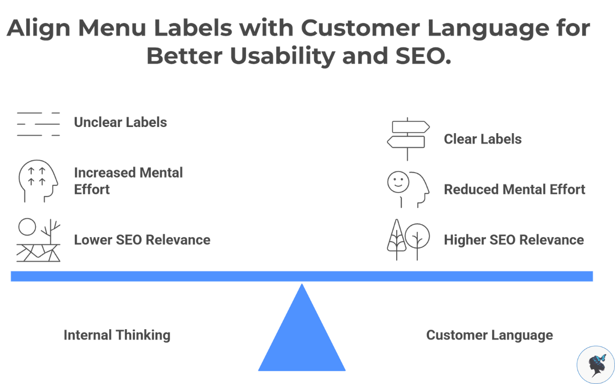
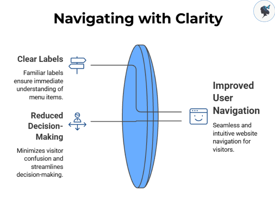
Use Familiar Labels

Visitors should immediately understand where each menu item leads.

infograph: Mobile menu hierarchy
Mobile menu hierarchy

Clear labels such as:

  • Services
  • Pricing
  • Contact
  • Locations
  • FAQs

usually perform better than creative alternatives that require interpretation.

Navigation should reduce decision-making, not increase it.

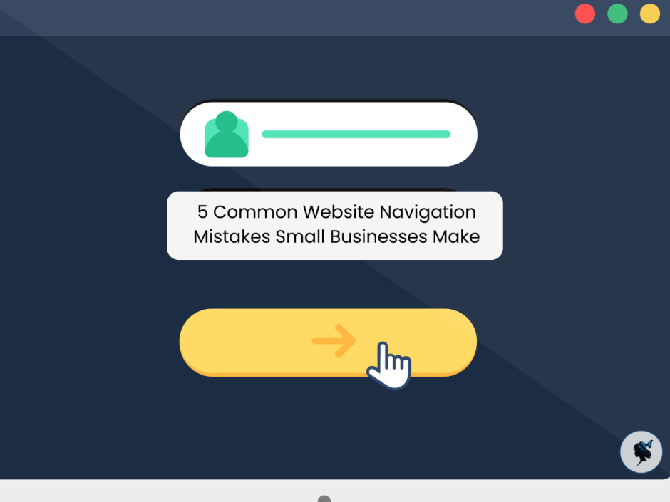
More about navigation mistakes here.

Prioritize Customer Goals

Business owners often organize menus around internal departments or company structure.

Customers think differently.

infograph: Aligning business and customer priorities
Aligning business and customer priorities

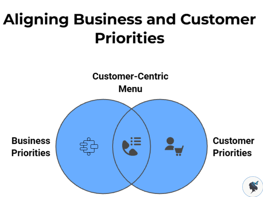
A homeowner searching for a plumber wants service information and contact details. A restaurant customer wants menus, reservations, and hours. An online shopper wants categories and checkout access.

The menu should reflect customer priorities first.

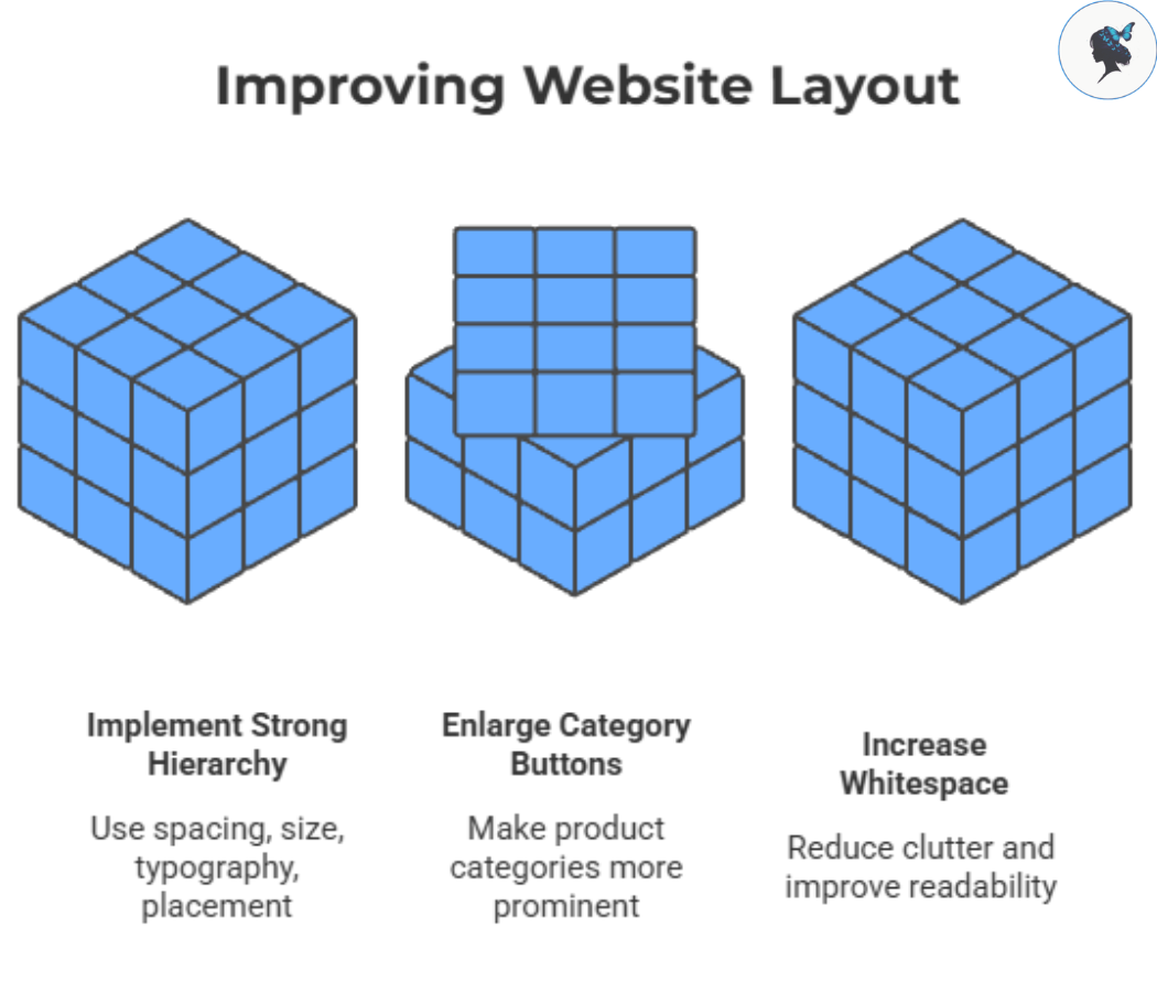
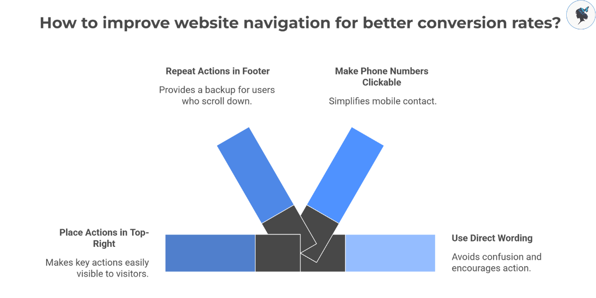
Make Important Actions Easy to Reach

Your most valuable actions should never be hidden.

infograph: Enhancing user experience through easy access
Enhancing user experience through easy access

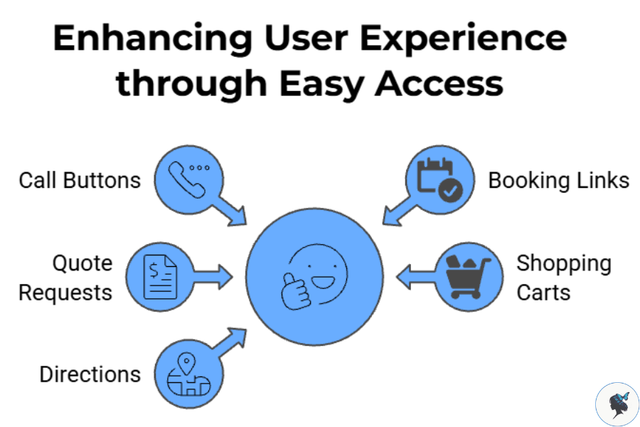
Consider highlighting:

  • Call buttons
  • Booking links
  • Quote requests
  • Shopping carts
  • Directions

A good rule of thumb is that users should be able to reach key actions within one or two taps.

More about simplifying your menu here.

Common Mobile Navigation Mistakes
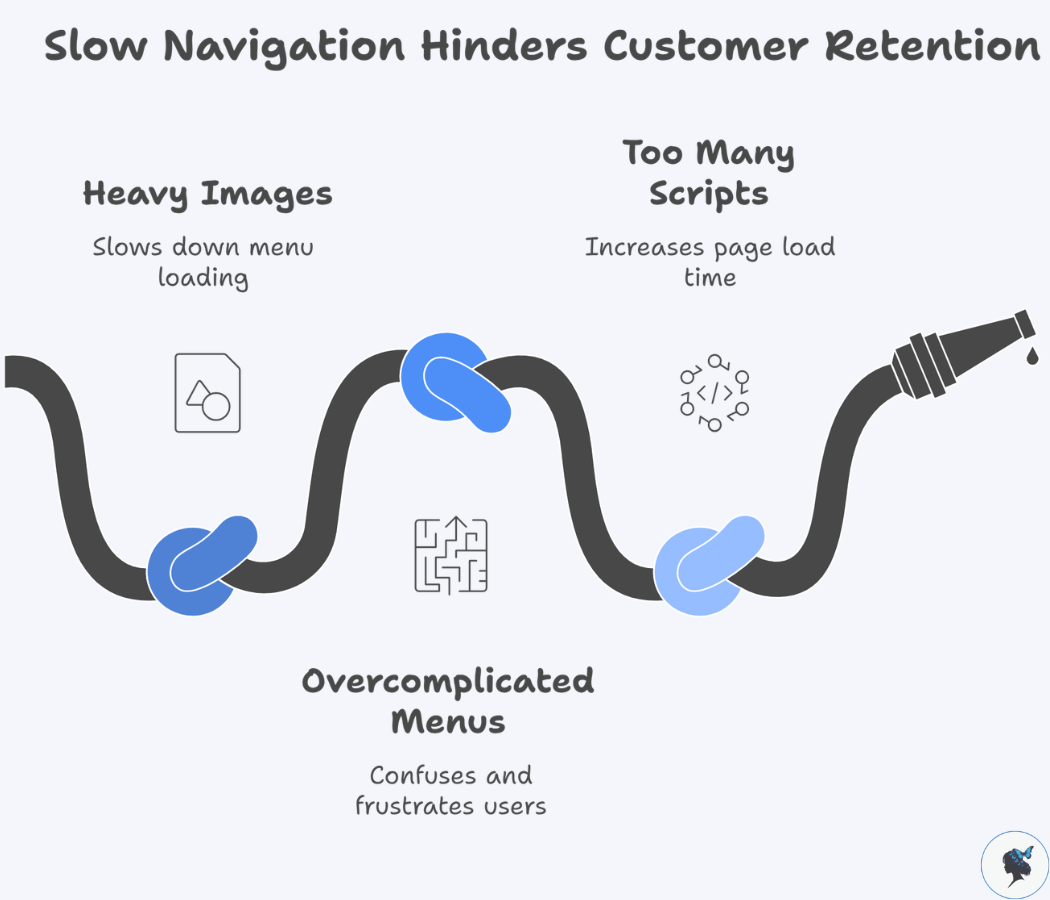
Too Many Menu Items

Long menus increase cognitive load and make decisions harder.

If visitors must scroll extensively through navigation options, it may be time to simplify.

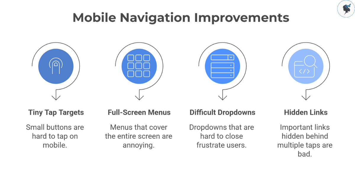
Deep Menu Structures

Multi-level navigation can work for large websites, but excessive nesting often frustrates mobile users.

Whenever possible:

  • Limit menu depth
  • Group related content logically
  • Keep pathways short
infograph: Common mobile navigation mistakes
Common mobile navigation mistakes

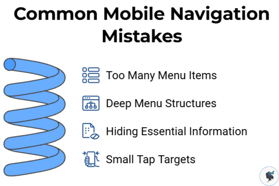
Hiding Essential Information

Many businesses unintentionally bury information customers need most.

Common examples include:

  • Business hours
  • Contact information
  • Pricing
  • Service areas
  • Reservation options

If customers frequently call to ask basic questions, your navigation may need improvement.
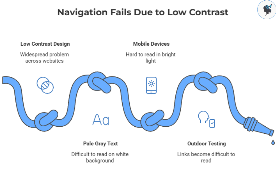
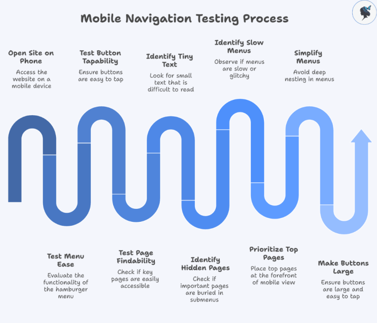
Small Tap Targets

Mobile navigation should be designed for thumbs, not mouse pointers.

Buttons and menu items that are difficult to tap can create friction and lead to abandoned visits.

Practical Ways to Improve Your Mobile Menu

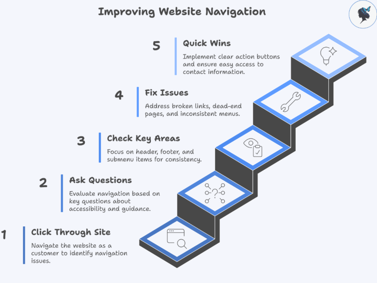
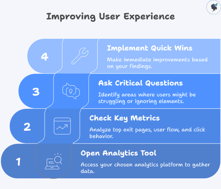
Review Your Analytics

Before redesigning navigation, identify:

  • Most-visited pages
  • Most common conversion paths
  • Highest-performing content

Your menu should support actual customer behavior rather than assumptions.

More about using data to improve user experience here.

Test With Real Users

Ask a few customers, employees, or friends to complete common tasks on their phones.

Examples:

  • Find your contact information
  • Request a quote
  • Locate a service page
  • Complete a purchase

Observe where they hesitate.

These moments often reveal navigation problems faster than analytics alone.

infograph: Improving mobile menu navigation
Improving mobile menu navigation

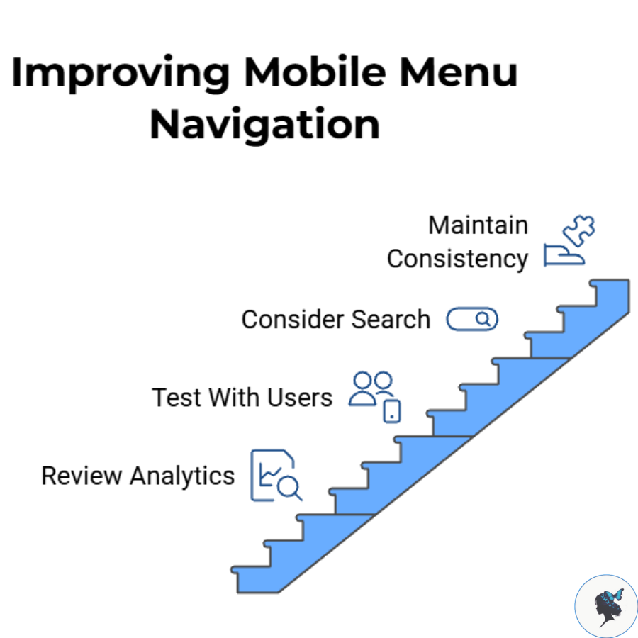
Consider Search for Larger Sites

If your website contains:

  • Large product catalogs
  • Extensive service offerings
  • Resource libraries

adding search functionality may improve navigation efficiency.

Maintain Consistency

Menu placement, labels, and navigation behavior should remain consistent throughout the website.

Consistency reduces learning effort and helps visitors feel confident as they browse.

Examples of Effective Mobile Navigation

infograph: Local service business navigation structure
Local service business navigation structure

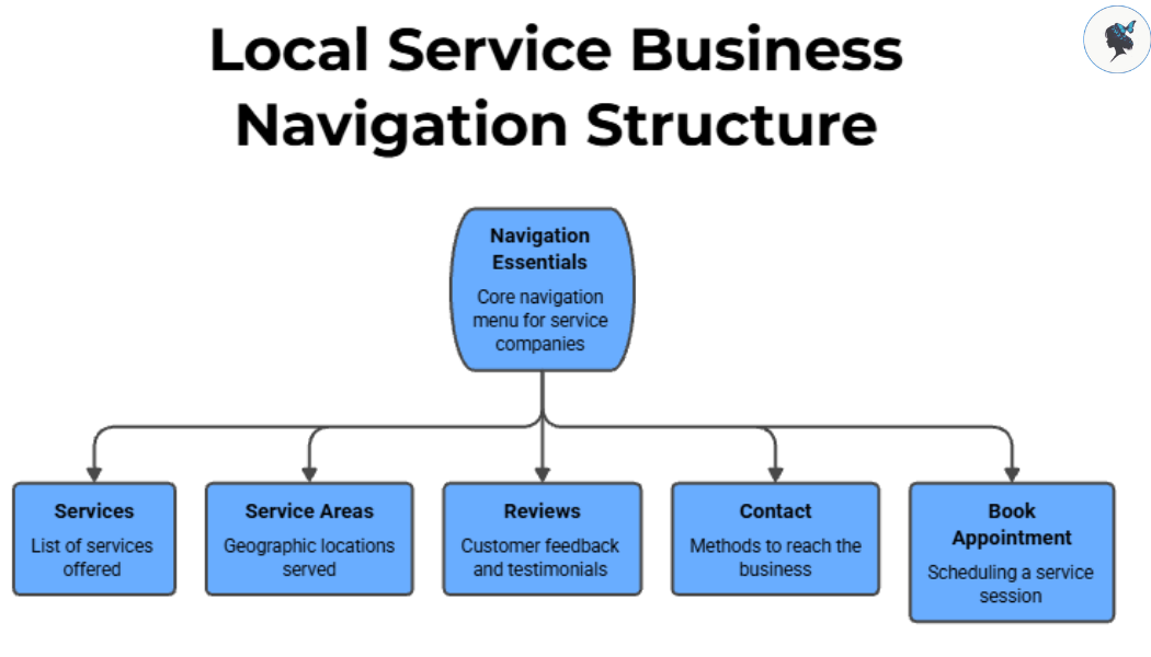
Local Service Businesses

Many successful service companies keep navigation focused on a few essentials:

  • Services
  • Service Areas
  • Reviews
  • Contact
  • Book Appointment

This approach aligns with what most customers need immediately.

Restaurant Websites

Strong restaurant mobile experiences often emphasize:

  • Menu
  • Reservations
  • Hours
  • Location

Visitors can quickly find information without navigating multiple layers.

Small E-commerce Stores

Successful online retailers typically make these elements highly visible:

  • Product Categories
  • Search
  • Cart
  • Customer Support

Reducing friction during shopping helps customers move more efficiently toward purchase.

The Business Impact of Better Navigation

While navigation alone will not guarantee higher sales, it can remove obstacles that prevent customers from taking action.

Mobile users increasingly expect fast, intuitive experiences. At the same time, Google continues to emphasize user experience signals through initiatives such as mobile-first indexing and Core Web Vitals, which focus on performance and usability. While content remains the primary ranking factor, usability improvements often support stronger engagement and business outcomes.

infograph: Mobile menu optimization for sales
Mobile menu optimization for sales

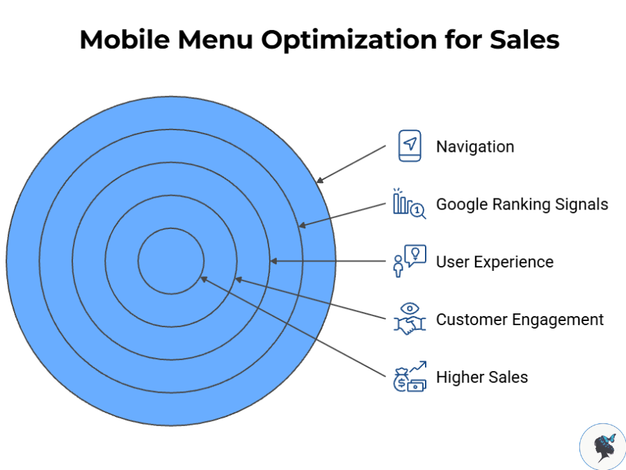
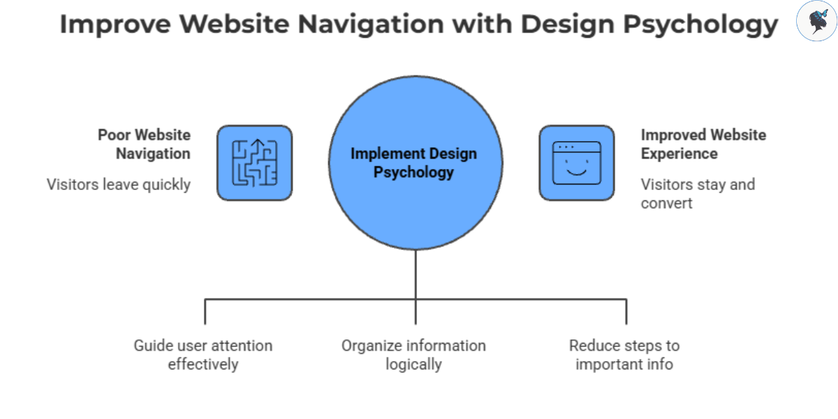
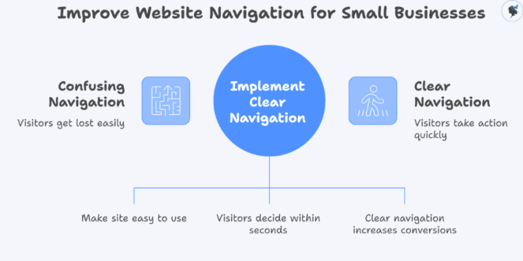
For small businesses, the goal is not to create the most sophisticated menu. The goal is to create the clearest path between a visitor and the action you want them to take.

A simple, customer-focused mobile menu can help visitors find what they need faster, improve their experience, and increase the likelihood that they become paying customers.

Using Color & Layout to Improve Navigation

▶ Table of Contents

How Small Businesses Can Use Design Psychology to Create Smoother Website Experiences

When visitors land on your website, they make decisions quickly. Within seconds, they decide whether your business feels trustworthy, easy to use, and worth their time.

That decision is heavily influenced by navigation.

infograph: Improve website navigation with design psychology
Improve website navigation with design psychology

If customers cannot easily find pricing, services, booking options, or contact information, they often leave without taking action. For small businesses, that means lost sales, missed inquiries, and lower customer confidence.

The good news is that improving navigation does not always require a full redesign. In many cases, strategic use of color and layout can dramatically improve how visitors move through your website.

Recent UX research in 2026 continues to show that users prefer simpler interfaces, clearer visual hierarchy, and faster pathways to important information. Small business owners who understand these principles can create websites that feel more intuitive, professional, and user-friendly without overwhelming budgets or technical complexity.

In this article, we’ll explore practical ways to use color psychology and layout strategies to improve website navigation, along with real-world examples and quick wins you can implement immediately.


Why Navigation Matters More Than Ever in 2026

Today’s website visitors have extremely high expectations.

Whether someone is booking a fitness class, ordering catering, or comparing local service providers, they expect websites to feel as polished and effortless as the apps they use every day.

According to recent accessibility and UX reporting from 2026, many business websites still struggle with mobile navigation clarity and usability. Poor menu organization and weak visual hierarchy remain major reasons users abandon websites early.

infograph: User expectations
User expectations

Modern users want what UX designers often call “low-friction browsing.” In practical terms, this means:

  • Fewer distractions
  • Clear menu structures
  • Obvious next steps
  • Easy-to-read pages
  • Strong visual cues

When navigation feels effortless, users stay longer and are more likely to convert.


How Color Influences Navigation

Many small businesses think of color primarily as branding.

But color is also one of the strongest navigational tools available.

The right colors help users understand:

  • Where to click
  • What matters most
  • Which actions to take next

Poor color choices, on the other hand, create confusion and visual fatigue.


1. Use One Consistent Accent Color for Important Actions

One of the simplest and most effective improvements is using a single accent color consistently for primary actions.

Infograph: How to improve website user experience with accent colors?
How to improve website user experience with accent colors?

For example:

  • “Book Now”
  • “Contact Us”
  • “Start Free Trial”
  • “Add to Cart”

When these actions always appear in the same color, users learn to recognize them instantly.

Recent web design analysis in 2026 shows that green and blue continue to perform especially well for trust-building and action-oriented interfaces.

Real-World Example

A fitness studio could use bright green buttons consistently for membership signups, trial bookings, and class scheduling. When calls-to-action share the same visual treatment, visitors learn to recognize the next step more quickly.

More about the importance of clear CTAs here.

Quick Win

Audit your website today and identify your most important customer action.

Then:

  • Use one consistent color for that action everywhere
  • Remove competing button colors
  • Keep the style visually consistent across pages

2. Reduce Visual Noise

One of the strongest UX trends in 2026 is the move toward calmer, cleaner interfaces.

Recent UX reporting shows that designers are increasingly reducing visual clutter, simplifying navigation, and using softer, more restrained color palettes to reduce cognitive overload and improve readability. Experts describe this shift as “calm design,” where interfaces prioritize clarity, whitespace, and predictable user flows over excessive visual stimulation.

Infograph: Calm design improves UX
Calm design improves UX

Many small business websites accidentally overwhelm visitors with:

  • Too many colors
  • Multiple font styles
  • Flashing banners
  • Excessive promotional graphics

This makes navigation harder because users struggle to identify what deserves attention.

Real-World Example

Imagine a boutique hotel website in Singapore with multiple flashing promotions, rotating homepage sliders, and several competing button colors. Visitors may struggle to identify the fastest path to booking a room.

By simplifying the interface — removing unnecessary sliders, switching to neutral backgrounds, and using a single accent color for booking actions — the website becomes easier to scan and navigate. The booking process feels clearer because users can immediately identify the primary action on the page.

Quick Win

Limit your design palette to:

  • One primary background color
  • One text color
  • One accent color

This creates stronger visual focus and cleaner navigation.


3. Improve Contrast for Better Readability

Navigation fails when users cannot clearly see links, menus, or buttons.

Unfortunately, low-contrast design remains a widespread problem.

Accessibility-focused UX experts in 2026 continue to emphasize stronger contrast ratios to improve readability across devices and lighting conditions.

infograph: Navigation fails due to low contrast
Navigation fails due to low contrast

Real-World Example

Consider a retail website in London that uses pale gray navigation text on a white background. While the design may look modern, low contrast can make menus difficult to read, especially on mobile devices or in bright lighting conditions.

By switching to darker typography and adding clearer hover states, the navigation becomes easier to scan and interact with. Users can identify product categories more quickly and move through the site with less effort.

Quick Win

Test your website on a smartphone outdoors.

If navigation links or buttons become difficult to read in sunlight, your contrast likely needs improvement.


Layout Strategies That Improve Navigation

Color helps guide attention, but layout determines how users move through information.

Strong layouts reduce confusion and make websites feel intuitive.


1. Simplify Your Navigation Menu

Too many choices slow users down.

UX researchers often connect this principle to cognitive overload: when users are presented with too many navigation options at once, decision-making becomes slower and more frustrating.

For that reason, many usability specialists recommend keeping primary website navigation focused and concise — typically around five to seven top-level menu items whenever possible. Cleaner navigation structures help visitors scan pages more quickly and find important information with less effort, especially on mobile devices.

Infograph: Navigation clarity
Navigation clarity

Common Navigation Problems

One of the biggest mistakes small businesses make is to create menus with vague labels like:

  • Solutions
  • Resources
  • Discover
  • Learn More

These terms force users to guess.

Better Alternatives

Replace vague wording with direct language:

  • Services
  • Pricing
  • Book Online
  • Contact

Real-World Example

A café website in Toronto might simplify its navigation to just five core options:

  • Menu
  • Reservations
  • Catering
  • About
  • Contact

This makes browsing faster and reduces decision fatigue for first-time visitors.

Quick Win

Review your current navigation menu and ask:

  • Can two items be combined?
  • Are labels immediately understandable?
  • Is every menu item truly necessary?

You might like our post: How a Simple Menu Can Boost Your Sales


2. Create a Clear Visual Hierarchy

Good layouts naturally guide the eye.

Visitors should immediately understand:

  1. What the page is about
  2. What action to take
  3. Where to find supporting information

Strong hierarchy uses:

  • Spacing
  • Button size
  • Typography
  • Placement
Infograph: Improving website layout
Improving website layout

Real-World Example

Imagine a retail website in London with crowded promotional banners, small category links, and limited spacing between sections. Visitors may struggle to identify where to click first, especially on mobile devices.

By enlarging category buttons, increasing whitespace, and reducing unnecessary promotional clutter, the homepage becomes easier to scan. Users can identify product categories more quickly and move through the site with less hesitation.ith less hesitation.

Quick Win

Look at your homepage for five seconds.

Ask yourself:

  • Is the main action obvious?
  • Are important sections visually prioritized?
  • Does anything distract from the core goal?

3. Optimize Navigation for Mobile Users

For most small businesses, mobile traffic now represents the majority of website visits.

Yet many websites still treat mobile navigation as an afterthought.

Common mobile problems include:

  • Tiny tap targets
  • Crowded dropdown menus
  • Oversized sticky headers
  • Hidden search functions

Recent UX testing in 2026 suggests that simplified sticky navigation bars can improve conversions when implemented carefully.

infograph: Seamless mobile user journeys
Seamless mobile user journeys

Real-World Example

Imagine a tour company in Sydney with a mobile website that originally includes multiple menu options, promotional banners, and scattered booking links. Users may struggle to decide where to start, especially when trying to book quickly on a phone.

By simplifying the mobile navigation to three clear actions — Tours, Pricing, and Book Now — the experience becomes more focused. Users can immediately understand their options and move toward booking without unnecessary distractions.pletion rates.

Quick Win

Open your website on your phone and attempt to:

  • Find pricing
  • Contact support
  • Book a service

If any step feels frustrating or slow, your customers likely feel the same way.

More about mobile optimization here.


Small Changes Can Create Major UX Improvements

One of the biggest misconceptions about website usability is that improvement requires expensive redesigns.

In reality, some of the most effective navigation improvements are surprisingly simple:

  • Reducing menu clutter
  • Improving contrast
  • Using consistent button colors
  • Adding whitespace
  • Simplifying mobile layouts

Good navigation is ultimately about reducing effort.

infograph: Website usability improvements
Website usability improvements

When visitors can move through your website confidently and intuitively, they are more likely to trust your business, stay engaged, and take action.

As user expectations continue rising in 2026, small businesses that prioritize clarity and simplicity will stand out immediately.

You do not need a flashy website to create a strong user experience.

You need a website that feels easy to use.

Need help? Contact us today!

5 Common Website Navigation Mistakes Small Businesses Make

▶ Table of Contents

Most small business websites do not fail because the product is bad. They fail because visitors get confused, frustrated, or lost before they take action.

That sounds harsh, but it is usually fixable.

If someone lands on your website and cannot quickly answer basic questions like “What do you do?”, “How much does it cost?”, or “How do I contact you?”, they often leave within seconds. Navigation is what guides people through those answers. It also helps search engines understand your site structure, which affects how easily customers find you online.

Here are five navigation mistakes that quietly cost small businesses traffic, leads, and sales — plus practical ways to fix them yourself.


1. Your Menu Has Too Many Options

A common mistake is trying to fit every page into the top navigation bar.

You see menus stuffed with links like:

  • Home
  • About
  • Services
  • Pricing
  • Portfolio
  • Blog
  • Testimonials
  • FAQ
  • Resources
  • Careers
  • Contact
  • Events

To a business owner, that feels thorough. To a visitor, it feels like work.

Research from the Baymard Institute found that most websites still perform poorly in homepage and navigation usability, especially on mobile devices. Their 2025 benchmark reported that 67% of mobile sites had “mediocre-to-poor” navigation performance.

infograph: Simplifying website navigation
Simplifying website navigation

When people face too many choices, they hesitate. Psychologists sometimes call this “choice overload.” On websites, it usually means visitors stop exploring altogether.

A simpler menu works better.

Try this instead:

  • Keep your main menu to roughly 5–7 items
  • Combine related pages under broader categories
  • Move secondary links into the footer
  • Prioritize pages tied directly to sales or inquiries

For example, instead of separate links for “Roof Repair,” “Emergency Roofing,” and “Roof Inspection,” a roofing company could group them under one “Services” menu.

The goal is not to hide information. It is to make decisions easier.

More about simple menus here.


2. Your Navigation Labels Are Too Vague

Small businesses often write menu labels based on internal thinking instead of customer language.

Examples include:

  • “Solutions”
  • “Capabilities”
  • “What We Do”
  • “Resources”

The problem is that visitors should not have to guess what those mean.

Someone looking for pricing wants to see “Pricing.” Someone trying to book an appointment wants “Book Appointment.” Clear labels reduce mental effort.

infograph: Align menu labels with customer language for better usability and SEO
Align menu labels with customer language for better usability and SEO

Baymard’s usability research repeatedly shows that unclear categories and labels slow users down and increase failed navigation attempts.

This matters for SEO too. Search engines use page structure and wording to understand what your website is about. Clear navigation labels help reinforce relevance.

A simple rule helps here:

Use the words your customers would type into Google.

Good examples:

  • “Services” instead of “Solutions”
  • “Pricing” instead of “Plans & Packages”
  • “Contact” instead of “Let’s Connect”

If you are unsure, ask three customers what they expect to find when they click a menu item. If their answers differ wildly, the label is probably unclear.

You might like our post: how to audit your site navigation in 30 minutes.


3. Your Most Important Action Is Hard to Find

Many small business websites accidentally bury the action they want visitors to take.

The contact page is hidden. The booking button disappears on mobile. The phone number only appears on one page.

This creates friction right at the moment someone is ready to act.

Even small obstacles lower conversion rates.

Recent conversion research notes that users now tolerate far less friction than they did a few years ago. Visitors compare options quickly and leave when the next step is unclear.

infograph: How to improve website navigation for better conversion rates?
How to improve website navigation for better conversion rates?

Your navigation should make the next step obvious.

Here is a practical approach:

  • Put “Contact,” “Book Now,” or “Get a Quote” in the top-right area of the menu
  • Repeat important actions in the footer
  • Make phone numbers clickable on mobile
  • Keep action wording direct and simple

Avoid clever wording like “Start Your Journey.” It sounds polished, but many users do not immediately know what it means.

Clarity usually beats creativity in navigation.


4. Your Mobile Navigation Is Frustrating

This one hurts more businesses than they realize.

A navigation menu may work perfectly on desktop but become annoying on a phone:

  • Tiny tap targets
  • Menus that cover the whole screen
  • Dropdowns that are difficult to close
  • Important links hidden behind multiple taps

That matters because mobile traffic now dominates many industries.

Baymard’s 2025 mobile UX research found that mobile navigation remains one of the weakest-performing parts of many websites.

infograph: Mobile navigation improvements
Mobile navigation improvements

Google also continues prioritizing mobile-first indexing, meaning your mobile experience directly affects search visibility.

You do not need an expensive redesign to improve this.

Start with these checks:

  • Test your site on your own phone weekly
  • Make buttons large enough to tap comfortably
  • Keep menus short on mobile
  • Ensure visitors can reach key pages in 1–2 taps
  • Check load speed on cellular data, not just Wi-Fi

A useful mindset shift: your mobile site is not a smaller desktop site. It is a different experience with different user behavior.

More about mobile optimization here.


5. Your Website Structure Grew Without a Plan

This happens naturally over time.

You add a new service page. Then a blog. Then a seasonal promotion. Then another dropdown.

After a few years, the site becomes a maze.

Users struggle to understand where they are. Search engines struggle to understand page relationships. Important pages stop getting visibility.

infograph: Building a user-friendly website
Building a user-friendly website

Good navigation is not only about menus. It is about structure.

A clear structure helps both humans and search engines move through your site logically.

A simple framework works well for many small businesses:

  • Main services
  • About
  • Pricing or Packages
  • Blog or Resources
  • Contact

Then organize supporting pages underneath those categories.

Internal links matter too. If you write a blog post about kitchen remodeling, link naturally to your kitchen remodeling service page.

SEO discussions in 2025 increasingly emphasize site structure, topical organization, and user experience signals rather than just keywords alone.

You do not need a giant website. You need a website that makes sense.


Final Thoughts

Website navigation is easy to ignore because it feels “technical.” But visitors notice it immediately, even if they cannot explain why.

A confusing navigation system creates stress. A clear one creates momentum.

If you only fix one thing this week, do this:

  1. Open your site on your phone
  2. Try to contact yourself as if you were a first-time visitor
  3. Count how many taps it takes
  4. Notice where you hesitate

Those small moments of hesitation are usually where customers disappear.

And the encouraging part is that navigation improvements are often inexpensive. You usually do not need a full redesign. You just need clearer paths, clearer labels, and fewer obstacles between visitors and the action you want them to take.

Need help? Contact us today!

How to Audit Your Website Navigation in 30 Minutes

▶ Table of Contents

If your website isn’t converting visitors into customers, your navigation might be the silent culprit.

Think about it: when someone lands on your site, they’re usually looking for something specific—your services, pricing, contact info. If they can’t find it quickly, they leave. No second chances.

The good news? You don’t need a full redesign to fix this.

In just 30 minutes, you can audit your website navigation and uncover simple improvements that make a big difference in user experience—and conversions.

Let’s walk through it step by step.


Why Website Navigation Matters (Especially for Small Businesses)

Your navigation acts like a map. If it’s confusing, people get lost. If it’s clear, they take action.

Infograph: Improve website navigation for small businesses
Improve website navigation for small businesses

For small businesses, this is critical because:

  • You often have fewer chances to win a customer
  • Visitors are more likely to compare you with competitors quickly
  • Every click (or missed click) affects your bottom line

Recent UX research shows:

  • Users decide within 10–20 seconds whether your site is easy to use
  • Clear navigation can increase conversions by up to 30%

So let’s fix yours—fast.


Your 30-Minute Navigation Audit Plan

Here’s how to break it down:

  • 0–5 minutes: First impression check
  • 5–15 minutes: Navigation structure review
  • 15–25 minutes: Mobile + usability check
  • 25–30 minutes: Analytics + quick fixes

Set a timer. Let’s go.


Step 1: Quick First Impression Check (5 Minutes)

Open your website like a new visitor would.

infograph: How to improve website navigation?
How to improve website navigation?

Ask yourself:

  • Can I instantly tell what this business does?
  • Is the menu easy to understand at a glance?
  • Do I know where to click next?

What to Look For

  • Too many menu items (overwhelming)
  • Confusing labels like “Solutions” or “Resources”
  • Important pages buried or missing

Quick Wins

  • Limit your main menu to 5–7 items
  • Use clear, simple labels:
    • “Services”
    • “Pricing”
    • “Contact”
    • What We Do

Example: A local cleaning business increased inquiries just by changing “Solutions” to “Home Cleaning Services”.

More about simple menus here.


Step 2: Review Your Navigation Structure (10 Minutes)

Now click through your site like a customer.

infograph: Improving website navigation
Improving website navigation

Ask These Questions

  • Can I reach key pages in 3 clicks or less?
  • Does every page guide me to a next step?
  • Is the menu consistent across all pages?

Check These Key Areas

  • Header menu (top navigation)
  • Footer links (often overlooked but important)
  • Any dropdown or submenu items

Common Issues to Fix

  • Broken links
  • Dead-end pages (no call-to-action)
  • Inconsistent menus between pages

Quick Wins

  • Add a clear call to action (CTA) button like:
    • “Book Now”
    • “Get a Quote”
    • “Call Us”
  • Make sure your Contact page is easy to find

2026 Insight: HubSpot’s latest UX reports show that clear navigation paths can increase conversions.

More about the importance of clear CTAs here.


Step 3: Check Mobile Navigation (10 Minutes)

More than half your visitors are likely on mobile—this step is crucial.

Infograph: Mobile navigation testing process
Mobile navigation testing process

Grab your phone and open your site.

What to Test

  • Is the menu easy to open (hamburger menu)?
  • Are buttons easy to tap?
  • Can you find key pages quickly?

Watch Out For

  • Tiny text or buttons
  • Important pages hidden in submenus
  • Menus that are slow or glitchy

Quick Fixes

  • Prioritize your top 3–4 pages in mobile view
  • Keep menus simple—avoid deep nesting
  • Make buttons large and easy to tap

2026 Trend: Google now prioritizes mobile-first indexing, meaning your mobile experience directly impacts your rankings.

More about mobile optimization here.


Step 4: Check Speed & Performance (5 Minutes)

Slow navigation = lost customers.

infograph: Slow navigation hinders customer retention
Slow navigation hinders customer retention

Use a Free Tool

What to Look For

  • Does your menu load instantly?
  • Do dropdowns open smoothly?

Common Problems

  • Heavy images in menus
  • Overcomplicated mega menus
  • Too many scripts running

Quick Wins

  • Simplify your menu design
  • Remove unnecessary animations
  • Avoid cluttered dropdowns

2026 Insight: Navigation delays of even 1 second can significantly increase drop-offs.


Step 5: Look at Real User Behavior (5 Minutes)

Now let’s see what your visitors are actually doing.

Infograph: Improving user experience
Improving user experience

Open Your Analytics Tool

Check

  • Top exit pages (where people leave)
  • User flow (how they move through your site)
  • Click behavior (what they actually use)

Ask

  • Are users ignoring your menu?
  • Are they getting stuck somewhere?

Quick Wins

  • Move popular pages into your main menu
  • Remove links no one clicks
  • Highlight high-converting pages

2026 Insight: Behavior-based navigation optimization is one of the top CRO (conversion rate optimization) trends this year.


Your 30-Minute Navigation Audit Checklist

Use this before you finish:

infograph: Navigation audit criteria
Navigation audit criteria

Clarity & Simplicity

  • Menu has 5–7 items max
  • Labels are clear and easy to understand
  • No jargon or vague terms

User Experience

  • Key pages reachable within 3 clicks
  • No broken links
  • Navigation is consistent across pages

Mobile Experience

  • Menu works smoothly on mobile
  • Buttons are easy to tap
  • Important pages are easy to find

Performance

  • Navigation loads quickly
  • No lag in dropdowns
  • No unnecessary complexity

User Behavior

  • Reviewed analytics (GA4 or similar)
  • Identified top exit pages
  • Adjusted navigation based on real data

Common Navigation Mistakes Small Businesses Make

Avoid these:

  • Too many menu options (decision overload)
  • Trying to sound “clever” instead of clear
  • Hiding important pages (like pricing or contact)
  • Ignoring mobile users
  • Never reviewing analytics

Real Example: In real-world CRO case studies, simplifying website navigation has led to significant performance gains. For example, one B2B company saw a 200% increase in conversions after restructuring and testing its navigation.


Conclusion: Small Fixes, Big Results

You don’t need a full website redesign to improve your results.

Sometimes, all it takes is:

  • Clearer labels
  • Simpler structure
  • Better mobile experience

And the best part? You can start right now.

Your Next Step

Set a 30-minute timer and run this audit on your website today.

Even a few small changes could mean:

  • More clicks
  • More inquiries
  • More customers

Need help? Contact us today!

Top Metrics Travel Marketers Should Track

▶ Table of Contents
  1. Introduction
  2. Website Traffic Metrics
  3. Conversion Metrics
  4. SEO Performance Metrics
  5. Social Media Metrics
  6. Email Marketing Metrics
  7. Customer Satisfaction Metrics
  8. Advertising Metrics

Introduction

In today’s competitive travel industry, data-driven decisions are essential for success. Tracking the right marketing metrics helps travel brands understand what’s working, optimize campaigns, and boost bookings. However, with so many data points available, knowing which ones truly matter can be overwhelming.

infograph: Travel marketing success pyramid
Travel marketing success pyramid

This guide breaks down the top metrics every travel marketer should track, with examples and actionable tips to help you make the most of your marketing efforts.


Website Traffic Metrics

Tracking your website’s traffic provides a clear picture of your brand’s online visibility and user engagement.

infograph: Website traffic metrics for travel brands
Website traffic metrics for travel brands
  • Total Visitors: This is the number of people visiting your site. Monitoring growth here helps gauge the effectiveness of your awareness campaigns. For example, a spike in visitors after launching a new Instagram campaign indicates successful cross-channel promotion.
  • Source/Medium: Understand where your traffic comes from—organic search, paid ads, social media, or referrals. This insight helps allocate budget effectively. If most visitors come from organic search, investing in SEO makes sense.
  • Bounce Rate: The percentage of visitors who leave after viewing only one page. A high bounce rate may suggest your landing pages need improvement or your audience targeting is off.

Wander Women Hot Tip: Use Google Analytics to segment traffic sources and identify your most valuable channels. Aim to reduce bounce rates by improving page load speed and creating compelling content.


Conversion Metrics

Conversions show how well your website turns visitors into customers or leads.

infograph: Website conversion funnel
Website conversion funnel
  • Booking/Lead Conversion Rate: Track the percentage of visitors who complete bookings or submit inquiries. Improving this metric directly impacts revenue.
  • Click-Through Rate (CTR): Measures how often users click on your calls-to-action (CTAs) or ads. For example, a low CTR on a “Book Now” button might signal unclear messaging or poor placement.
  • Cost Per Acquisition (CPA): The average amount spent to gain a paying customer. Knowing your CPA helps optimize ad spend and marketing ROI.

Wander Women Hot Tip: Use conversion tracking tools like Google Ads Conversion Tracking or Facebook Pixel to monitor and optimize user journeys.


SEO Performance Metrics

SEO is crucial for attracting organic traffic, especially for travel brands targeting specific destinations or experiences.

infograph: SEO performance cycle
SEO performance cycle
  • Keyword Rankings: Monitor how well your targeted keywords rank on Google. Tools like Semrush or Ahrefs can track changes over time.
  • Organic Traffic: The number of visitors arriving through unpaid search results. Growth here indicates successful SEO strategies.
  • Backlinks: Quantity and quality of other websites linking to your site affect your search ranking and credibility.

Wander Women Hot Tip: Regularly audit your site’s SEO health and build backlinks through guest posts, partnerships, and high-quality content.


Social Media Metrics

Social media drives engagement and brand loyalty in travel marketing.

infograph: Social media marketing metrics
Social media marketing metrics
  • Engagement Rate: This includes likes, comments, and shares relative to your follower count. High engagement signals resonant content.
  • Follower Growth: Track how fast your audience grows on platforms like Instagram, Facebook, or TikTok.
  • Referral Traffic: Measure how many visitors come to your site from social media posts.

Wander Women Hot Tip: Use native platform analytics (e.g., Instagram Insights) and tools like Sprout Social to analyze engagement and adjust your content strategy accordingly.

You might like: TikTok travel trends this year.


Email Marketing Metrics

Email remains a powerful channel for nurturing leads and driving repeat bookings.

infograph: How to improve email marketing performance?
How to improve email marketing performance?
  • Open Rate: Percentage of recipients who open your emails. Low rates may indicate ineffective subject lines or timing.
  • Click-Through Rate: Measures how many recipients click links within your emails.
  • Unsubscribe Rate: Indicates how many people opt out; high rates might suggest irrelevant content or too many emails.

Wander Women Hot Tip: Segment your email list based on traveler preferences or behaviors for personalized, high-performing email campaigns.


Customer Satisfaction Metrics

Happy customers are your best marketers.

infograph: Building customer loyalty
Building customer loyalty
  • Net Promoter Score (NPS): Measures likelihood of customers recommending your brand. Scores above 50 are considered excellent.
  • Review Ratings: Track average ratings on platforms like TripAdvisor or Google Reviews to monitor brand reputation.
  • Customer Feedback: Collect qualitative insights through surveys or direct messages to uncover pain points and opportunities.

Wander Women Hot Tip: Actively respond to reviews and use feedback to improve your services, which boosts loyalty and referrals.


Advertising Metrics

Paid advertising fuels rapid growth but must be carefully managed.

infograph: Unveiling the dimensions of paid advertising metrics
Unveiling the dimensions of paid advertising metrics
  • Return on Ad Spend (ROAS): Revenue generated per dollar spent on ads. A ROAS greater than 4:1 is often targeted in travel campaigns.
  • Impressions: How often your ads are shown. Useful for brand awareness metrics.
  • Cost Per Click (CPC): Average cost per ad click; lower CPC means more efficient spending.

Wander Women Hot Tip: Continuously test ad creatives and targeting options to maximize ROAS. Use A/B testing for best results.


Conclusion

Tracking these key metrics empowers travel marketers to make informed decisions, optimize campaigns, and grow their brands sustainably. Use the right analytics tools, regularly review your data, and adjust your strategies accordingly to stay competitive in the evolving travel marketplace.

Need help setting up analytics dashboards or interpreting your data? Contact us today!


TikTok Travel Trends to Watch This Year

▶ Table of Contents
  1. Introduction
  2. Emerging Destinations Gaining Popularity
  3. Evolving Traveler Preferences
  4. Viral Travel Trends on TikTok
  5. Influencer Impact and User-Generated Content
  6. Sustainable and Ethical Travel
  7. Interactive and Immersive Travel Content
  8. Conclusion

Introduction

TikTok has rapidly become a powerful force in travel inspiration and decision-making. With over 1 billion active users globally as of 2024, the platform’s short-form videos shape what destinations and travel experiences capture the imagination of millions.

infograph: Top TikTok travel influence factors
Top TikTok travel influence factors

Travel brands and travelers alike must stay on top of TikTok trends to leverage this influence and tap into emerging travel behaviors.


Emerging Destinations Gaining Popularity

TikTok’s viral nature has brought attention to lesser-known but breathtaking destinations. For instance, Jeju Island, South Korea, has become a hotspot due to its stunning volcanic landscapes and trendy cafés showcased in many viral videos. Similarly, AlUla in Saudi Arabia, with its dramatic sandstone canyons and luxurious desert resorts, has gained traction as a must-see Middle Eastern destination.

infograph: TikTok viral nature drives tourism
TikTok viral nature drives tourism

Other viral destinations include Chefchaouen, Morocco, famous for its vibrant blue streets, and the mystical Isle of Skye, Scotland, attracting travelers seeking natural beauty and ancient castles. These destinations offer a fresh alternative to over-touristed places, appealing especially to younger travelers eager to explore “hidden gems.”


Evolving Traveler Preferences

TikTok trends reveal a shift in traveler preferences, particularly among Gen Z and Millennials. There is a growing movement away from traditional all-inclusive resorts toward more authentic and adventurous experiences. Travelers now prioritize immersive cultural interactions, unique local experiences, and outdoor adventures.

infograph: Top travel trends driven by TikTok
Top travel trends driven by TikTok

Solo travel is surging, especially among women, who use TikTok to share empowering stories of self-discovery and independence. Women are a majority of solo travelers in many reports; one travel trend analysis notes that women account for roughly 75–84 % of all solo travelers globally.


Several niche travel trends have gained viral popularity on TikTok. “Hurkle-Durkling,” a trend focusing on the art of doing nothing and embracing relaxation, reflects a growing desire for wellness-focused travel experiences. This counters the “busy tourist” stereotype and appeals to those looking to recharge.

infograph: The intersection of wellness and work in travel
The intersection of wellness and work in travel

“Gig Tripping” involves combining travel with remote work or side gigs, allowing travelers to fund their adventures while exploring new places. This hybrid travel-work lifestyle is becoming a viable trend, especially as flexible work arrangements persist post-pandemic.


Influencer Impact and User-Generated Content

Micro-influencers and everyday travelers sharing authentic, unpolished content have become key drivers of travel inspiration on TikTok. According to a report by Influencer Marketing Hub, 82% of consumers trust micro-influencers over traditional celebrities.

infograph: Unveiling the powers of micro-influencers in travel
Unveiling the powers of micro-influencers in travel

This democratization of travel storytelling means travelers trust real experiences over glossy ads, encouraging brands to foster community and engagement rather than purely polished campaigns. User-generated content also expands reach organically, making it a crucial element in travel marketing strategies.

More about travel influencers here.


Sustainable and Ethical Travel

Sustainability is a growing priority for travelers, and TikTok has become a platform for promoting eco-friendly travel choices and responsible tourism. Content creators highlight sustainable accommodations, low-impact travel tips, and ways to support local communities.

infograph: Promoting sustainable travel on TikTok
Promoting sustainable travel on TikTok

An ecotourism statistics overview reported that sustainability remains important for around 84 % of global travelers in 2025, further underscoring that environmentally conscious choices are influencing travel decisions.


Interactive and Immersive Travel Content

TikTok’s integration of AR filters and immersive video formats is enhancing how travel content is consumed. Creators use augmented reality to provide virtual tours or showcase cultural elements interactively, making destinations more accessible to viewers.

infograph: Unveiling TikTok's impact on travel content
Unveiling TikTok’s impact on travel content

Short videos provide quick, engaging glimpses into destinations, making travel inspiration more immediate and digestible. As technology advances, we expect to see more travel brands experimenting with VR experiences and interactive storytelling on TikTok to captivate audiences.


Conclusion

TikTok continues to redefine travel marketing with viral destinations, evolving traveler preferences, and immersive content trends. Travel brands and enthusiasts should watch emerging spots like Jeju Island and AlUla, embrace authentic storytelling through influencers, and promote sustainable travel.

By staying attuned to TikTok’s fast-moving trends and leveraging its unique content formats, travel brands can engage new audiences and inspire the next generation of travelers. The future of travel inspiration is visual, interactive, and community-driven, and TikTok sits right at the center of this revolution.

Need help with TikTok? Contact us today!


Tracking Content ROI in Travel: How to Attribute Bookings and Leads Beyond Paid Ads

▶ Table of Contents
  1. Introduction
  2. Why Content Marketing Matters for Travel Agencies
  3. Methods to Track and Attribute Leads/Bookings to Content
  4. Tools and Analytics Platforms for Measuring Content Effectiveness
  5. Case Studies: Successful Attribution in Travel
  6. Actionable Tips to Improve Content Strategy Based on Attribution Insights
  7. Conclusion

Introduction

For travel agencies, content marketing is more than a brand-building exercise—it’s a revenue driver. Blogs, destination guides, social media posts, and videos all work together to engage travelers, answer their questions, and guide them toward booking. Yet, one of the biggest challenges agencies face is proving the ROI of content.

infograph: Content marketing ROI for travel agencies
Content marketing ROI for travel agencies

Unlike paid ads, which provide immediate tracking of clicks and conversions, content often has a longer, more subtle influence on bookings. Travelers may read multiple blog posts, follow your social media, and download itineraries before making a reservation. Accurately attributing bookings and leads to these content interactions is essential to justify investment and refine strategy.

Wander Women Hot Tip: Start by auditing all your content channels—blogs, emails, social media—to identify where travelers first engage and how content contributes to the booking journey.


Why Content Marketing Matters for Travel Agencies

Content is the bridge between travelers’ curiosity and their decision to book. Here’s why it’s essential:

Infograph: Foundations of content marketing
Foundations of content marketing
  • Builds Trust and Authority: Informative content like destination guides, tips, and itineraries positions your agency as an expert.
  • Supports Long-Term SEO: Evergreen content drives consistent organic traffic year-round.
  • Engages Travelers: Interactive blogs, videos, and social posts nurture leads before they book.
  • Improves Conversion Quality: Travelers who engage with content are typically better informed and more likely to convert.

Methods to Track and Attribute Leads/Bookings to Content

Attribution methods determine which content influences conversions. For travel agencies, consider these approaches:

infograph: Which attribution model should be used to track content performance?
Which attribution model should be used to track content performance?

1. First-Touch Attribution

  • Assigns credit to the first piece of content a traveler interacts with.
  • Helps identify top-of-funnel content that generates awareness.
  • Example: A blog post about “Best Beaches in Spain” introduces a traveler who later books a package.

Read our guide: The Complete Digital Marketing Funnel for Travel

2. Last-Touch Attribution

  • Assigns credit to the final content before a conversion.
  • Useful for recognizing content that directly drives bookings.
  • Example: An email campaign or detailed itinerary PDF that the traveler interacts with just before booking.

Read our guide: AI-Driven Email Personalization

3. Multi-Touch Attribution

  • Distributes credit across all interactions in the traveler’s journey.
  • Provides a holistic view of content influence, from blog posts to social media shares.
  • Example: Traveler reads a blog post, watches a YouTube destination video, and then opens a follow-up email before booking.

4. Assisted Conversions / Content Path Analysis

  • Shows which content contributed indirectly to bookings.
  • Useful for mid-funnel content like checklists, travel guides, and Instagram posts.

Wander Women Hot Tip: Track content performance by destination, season, or travel type to uncover hidden patterns of influence on bookings.


Tools and Analytics Platforms for Measuring Content Effectiveness

infograph: Tools for content measurement
Tools for content measurement

Google Analytics

  • Track goals and conversions for specific pages or campaigns.
  • Use multi-channel funnel reports to see how content interacts with paid, organic, and social channels.

CRM Systems (HubSpot, Salesforce)

  • Connect content interactions to individual leads.
  • Monitor the full customer journey from content engagement to booking.

Attribution Platforms (Ruler Analytics, Funnel.io)

  • Provide advanced multi-touch attribution reporting.
  • Identify which content pieces contribute the most revenue.

Marketing Automation Tools

  • Track emails, clicks, and content interactions.
  • Nurture leads through targeted campaigns and monitor content’s influence.

Wander Women Hot Tip: Use UTM parameters on blogs, social posts, and emails to track exactly which content drives traffic and leads.


Case Studies: Successful Attribution in Travel

Example 1 – Major UK Travel Company

A UK travel company adopted a multi-touch attribution model to better understand how customers moved across channels before making a booking. By mapping the full customer journey—rather than relying on last-click attribution—the company was able to evaluate the true impact of blogs, email, paid media, and social touchpoints working together. This approach revealed how different channels contributed at various stages of the funnel, enabling the marketing team to make more informed budget decisions, optimize campaign performance, and demonstrate the real business value of their marketing efforts, even when individual channels were not the final point of conversion.

Example 2 – Travel Nevada

Travel Nevada, the state’s official destination marketing organization, demonstrated how email newsletters paired with strong content can drive measurable engagement. After revamping its email strategy with a greater focus on travel inspiration, itineraries, and visitor guides, the organization saw clear performance gains across key metrics. Email-driven sessions to the website increased by 23%, while requests for the official visitor guide rose by 150%, indicating deeper engagement from subscribers actively planning trips. The campaign also led to substantial growth in newsletter sign-ups and partner referrals, reinforcing the role of content-led email marketing in moving audiences from inspiration to meaningful action.

Example 3 – Regional Tourism Board

Atout France, in partnership with regional tourism boards such as Provence-Alpes-Côte d’Azur, used market and performance data to adjust seasonal campaigns and promote autumn and winter travel to the French Riviera and Provence. By shifting messaging toward off-season experiences and targeting travelers earlier in the planning cycle, the initiative increased interest and bookings during typically slower periods, demonstrating how data-driven campaign optimization can help stimulate off-season tourism.

Wander Women Hot Tip: Identify content that consistently appears in the conversion path and prioritize updates, promotion, or repurposing.


Actionable Tips to Improve Content Strategy Based on Attribution Insights

Infograph: Content strategy cycle
Content strategy cycle
  • Prioritize High-ROI Content: Focus resources on blogs, guides, and videos that consistently contribute to bookings.
  • Optimize Underperforming Pages: Update information, add calls-to-action, or reformat content to increase engagement.
  • Align Content with Intent: Create content targeting high-intent searches based on attribution insights.
  • Test Content Formats: Experiment with videos, infographics, or interactive maps, and monitor which formats drive leads.
  • Quarterly Audits: Regularly review attribution data to refine strategy and adjust budgets.

Wander Women Hot Tip: Use attribution insights to forecast content ROI for upcoming campaigns, helping justify investment to leadership or stakeholders.


Conclusion

Attributing bookings and leads to content is essential for travel agencies looking to justify content marketing investment. While content may not generate immediate conversions like paid ads, it often influences the traveler’s journey at multiple touchpoints.

By implementing first-touch, last-touch, and multi-touch attribution, and leveraging analytics tools, agencies can:

  • Understand which content drives awareness and bookings
  • Optimize content strategy based on data-driven insights
  • Increase ROI and justify marketing spend

Final Wander Women Hot Tip: Start small by tracking first-touch and last-touch attribution, then scale to multi-touch for deeper insights. Treat your content as an investment that compounds over time, building trust, engagement, and ultimately, more bookings.

Need help tracking your ROI? Contact us today!

User-Generated Content for Travel Agencies: Legal Safety and SEO Optimization Strategies

▶ Table of Contents

Introduction

In the travel industry, authenticity sells. Travelers trust real experiences more than branded content, making user-generated content (UGC) an essential tool for travel agencies. From Instagram photos to blog reviews, UGC can increase engagement, conversions, and organic search visibility.

Infograph: Leveraging UGC in travel
Leveraging UGC in travel

However, there’s a catch: not all UGC is legally safe to use, and improperly optimized content may fail to deliver SEO benefits. Travel agencies need a clear strategy to leverage UGC effectively, while staying compliant and maximizing search performance.

Wander Women Hot Tip: Conduct an audit of your existing UGC sources. Identify which content is legally cleared and which requires permissions before embedding it on your website.

Read: using UGC to enhance trust.


What is User-Generated Content?

Infograph: The power of User-Generated Content
The power of User-Generated Content

UGC is content created by travelers, customers, or social media followers rather than your agency. It comes in many forms:

  • Photos and videos from trips
  • Reviews and testimonials on platforms like TripAdvisor, Google, or Yelp
  • Social media posts (Instagram, TikTok, Pinterest)
  • Travel blogs, itineraries, and stories written by travelers

Benefits for travel agencies include:

  • Authentic storytelling builds trust
  • Drives engagement and repeat visits
  • Supports long-tail SEO through naturally occurring keywords

Wander Women Hot Tip: Track UGC trends to see which types generate the most engagement and search traffic. For example, video highlights of popular destinations often outperform static images in clicks and shares.

More Social Media post ideas here.


Infograph: How to use UGC safely?
How to use UGC safely?

Using UGC without permission can lead to copyright infringement or privacy violations. Here’s what travel agencies need to know:

  • Photos, videos, and written content are automatically copyrighted to their creator.
  • Using someone else’s content without consent can result in takedown notices or legal penalties.

2. Permission and Licensing

  • Always obtain written consent from users before publishing their content.
  • Platforms like Instagram or TikTok offer content-sharing options, but always check terms of service.
  • Consider using Creative Commons licenses for legally safe content.

3. Privacy Considerations

  • Avoid featuring identifiable people without a model release, especially minors.
  • Ensure sensitive locations or personal details are not revealed without permission.

4. Consequences of Misuse

  • Legal disputes and fines
  • Damage to brand reputation
  • Content removal from search engines

Wander Women Hot Tip: Use a standardized UGC consent form for submissions. Include clauses for website, social media, and marketing use to ensure full coverage.


Benefits of UGC for Travel Agencies

infograph: UGC's impact on travel marketing
UGC’s impact on travel marketing

UGC is not just about authenticity—it can boost SEO, engagement, and conversions:

  • SEO Advantages:
    • Fresh content is regularly indexed by Google
    • Naturally incorporates long-tail keywords
    • Encourages backlinks from social shares
  • Engagement and Trust:
    • Travelers trust real experiences more than branded marketing
    • Increases time spent on destination pages
  • Conversions:
    • Influences bookings, inquiries, and newsletter sign-ups

A Nosto report found that 79% of people say UGC highly impacts their purchasing decisions, making it a critical marketing asset.

Wander Women Hot Tip: Feature UGC prominently on destination pages to boost dwell time and help Google recognize the page as valuable and authoritative.

You might be interested in: Creating Destination Guides That Rank and Convert


Optimizing UGC for SEO

infograph: Optimizing UGC for SEO
Optimizing UGC for SEO

To maximize UGC benefits, optimization is key:

1. Technical Considerations

  • Alt text for images: Include descriptive, keyword-rich text
  • Captions and metadata: Enhance relevance for search engines
  • Video metadata: Include titles, descriptions, and transcripts

Read our post: Image Optimization and Alt Text.

2. Content Integration

  • Embed UGC within destination guides, itineraries, and blog posts
  • Use internal linking from UGC to related tours, offers, or attractions

More about internal linking here.

3. Schema Markup

  • Review schema for testimonials
  • ImageObject schema for photos
  • VideoObject schema for video highlights

4. Moderation and Quality Control

  • Ensure UGC aligns with brand messaging
  • Remove low-quality or irrelevant content

Wander Women Hot Tip: Create UGC galleries with proper alt text and captions. This helps SEO while maintaining legal safety and visual appeal.


Encouraging and Curating UGC in the Travel Industry

infograph: UGC strategies
UGC strategies

1. How to Encourage UGC

  • Launch social media campaigns with branded hashtags
  • Run contests or giveaways incentivizing posts
  • Encourage reviews on Google, TripAdvisor, and Yelp

2. Curation Best Practices

  • Vet content for quality, relevance, and legal compliance
  • Rotate featured content regularly to keep pages fresh
  • Highlight top-performing posts to inspire engagement

Wander Women Hot Tip: Use a consistent branded hashtag for campaigns and feature traveler posts directly on destination pages to enhance authenticity and SEO simultaneously.


Conclusion

User-generated content is a powerful tool for travel agencies when used correctly:

  • Ensure legal safety through permissions and licensing
  • Optimize UGC for SEO to increase visibility and engagement
  • Curate and encourage high-quality content to keep pages fresh and relevant

Wander Women Hot Tip: Treat UGC as a living asset. Regularly update, optimize, and refresh it to maintain search performance, user trust, and compliance.

Need help? Contact us today!


More about content here:

How to Structure and Maintain Evergreen Destination Seasonal Content Hubs for Travel Sites

▶ Table of Contents
  1. Introduction
  2. Understanding Evergreen Content for Travel Destinations
  3. Why Build a Destination Content Hub
  4. Structuring a Seasonal Evergreen Content Hub
  5. Maintaining Seasonal Relevance
  6. Integrating User‑Generated Content (UGC)
  7. Promoting and Leveraging Seasonal Hubs
  8. Measuring Success and Iterating

Introduction

In the fast‑moving world of travel content, where every destination feels ten minutes away from being “over‑covered,” a smart approach is to build evergreen destination seasonal content hubs. These hubs combine the stability of timeless content with the freshness of seasonal relevance — creating resources that attract search engine traffic, engage travellers consistently, and stay top‑of‑mind year after year.

Why bother? Evergreen content continues to deliver long after publication; in fact, for many websites, evergreen content consistently drives more than a third of total organic traffic. In travel specifically, with seasonal patterns and shifting consumer habits, this hybrid approach of evergreen + seasonality gives you both resilience and relevance.

Wander Women Hot Tip: Start with a “destination hub” strategy rather than hundreds of disconnected blog posts. Think big, centralised, modular — build the library now so that future updates are smoother.


Understanding Evergreen Content for Travel Destinations

1. What Makes Content Truly Evergreen in Travel

infograph: Evergreen travel content
Evergreen travel content
  • Evergreen travel content covers topics that remain relevant regardless of year, season, or fleeting trends: e.g., “How to get to X destination,” “What you must pack for X,” “Cultural norms and local etiquette in X.”
  • It avoids being too tied to a fixed date (e.g., “Summer 2025 deals”) and instead focuses on enduring user needs.
  • In a travel‑destination hub, evergreen pieces can be the “core” of the hub: destination overview, transport and logistics, “must sees,” best time to go (with caveats), local culture, food, safety tips, etc.

2. SEO Benefits of Evergreen Content

infograph: Benefits of Evergreen Content for SEO
Benefits of Evergreen Content for SEO
  • Because it remains relevant, evergreen content drives consistent organic traffic. Search engines favour pages that continue to satisfy user intent, rather than topics that die out.
  • Evergreen pages give excellent internal‑linking opportunities (they become pillars that link out to seasonal or more specific pieces). That strengthens your site architecture and authority.
  • You save resources: you don’t have to constantly churn brand‐new content; instead you maintain and update. One guide noted companies prioritising evergreen content see a 5× higher return on investment than those focusing only on trend‑based content.

Wander Women Hot Tip: Identify 8–12 evergreen “pillar” pages for each destination (e.g., Getting There, Where to Stay, Food & Drink, Culture & Customs, Best Time to Visit, Practical Tips). These become the foundation of your hub. Then seasonal content layers on top.


Why Build a Destination Content Hub

1. Benefits Over Stand‑alone Blog Posts

infograph: Destination hub benefits
Destination hub benefits
  • A hub creates structure: instead of random blog posts, you have a parent page (“destination hub”) and child pages (evergreen + seasonal) that nest logically.
  • Search engines see this structure as topical authority: you’re demonstrating your site knows all about destination X, not just that you occasionally wrote about it.
  • For users, it’s better: if someone lands on your hub for “Visit X”, they find everything in one place — not just a blog post bouncing them out. This increases engagement, time on site, and reduces bounce rates.
  • Stand‑alone posts may generate a short‑term spike but then fade. A hub is more sustainable.

More about content clusters (hubs) here.

2. How Content Hubs Improve User Experience

infograph: Hub content suggestions
Hub content suggestions
  • Use the parent hub as a gateway: quick snapshot of destination + links to deeper dives (seasonal activities, upcoming festivals, itineraries, FAQs).
  • Provide navigation aids: e.g., a “Select your season” filter so travellers see what to do in spring vs winter.
  • Include rich content: maps, image galleries, interactive features (quiz: “Which season at X fits you best?”).
  • Add CTAs (calls to action): newsletter signup for seasonal updates, booking enquiry, user photo gallery submission.

Wander Women Hot Tip: Design the hub UI/UX like a mini‑magazine: think “Explore Destination X” homepage with cards for each season, “In this month”, “Insider tips”, “Traveller stories.” Make it visually appealing and scannable.


Structuring a Seasonal Evergreen Content Hub

1. Hub Architecture and Layout

infograph: How to structure the travel hub website?
How to structure the travel hub website?
  • Parent Hub Page: the first destination page a traveller lands on. It includes the overview, key selling points (“Why go here”), quick links to seasons, top experiences, and a “Start planning” CTA.
  • Child Pages — Evergreen Layer: logistics (how to get there, travel documents), accommodations, local culture, cuisine, “must‑do experiences”.
  • Child Pages — Seasonal Layer: each major season (Spring, Summer, Autumn, Winter) gets its own guide: best activities, events, weather guide, seasonal pros & cons, suggested itineraries.
  • Cross‑links and modules: On each seasonal page, link back to the evergreen pages (“Need to know about travel documents? Visit our logistics guide”). Likewise the evergreen page can link to each seasonal page (“Check what’s happening this winter”).
  • Sidebar / module widgets: “Upcoming festival in X”, “Traveller photo of the month”, social feed.
  • Consider a year‑round calendar of events embedded or linked.

2. Balancing Evergreen and Seasonal Content

infograph: Updating seasonal content
Updating seasonal content
  • Start with the evergreen core — this remains mostly stable year‑to‑year.
  • Then layer seasonal content — which may require annual updates (dates of festivals, seasonal deals, weather variations, new experiences).
  • Ensure seasonal pages maintain some evergreen components (e.g., “Spring in X: what you can do” still relevant from year to year) but highlight what changes.
  • Use a modular update approach: only parts of the seasonal pages change (dates, deals, new venues); rest remains. That keeps maintenance manageable.

3. Internal Linking Strategy

infograph: Enhancing website navigation
Enhancing website navigation
  • Link from parent hub – evergreen pages – seasonal pages.
  • On evergreen pages, include “Explore this destination by season” links.
  • On seasonal pages, include “Also check: full destination guide” links.
  • Use consistent anchor text: e.g., “Visit X in autumn” or “Autumn activities in Destination X”.
  • Use a “Related articles” module at bottom of every page to suggest deeper reads (which helps dwell time).
  • Perform periodic audits of links to ensure seasonal pages still point to correct evergreen pages and vice versa.

Wander Women Hot Tip: Set up a mini‑site‑map or interactive menu within the hub that lets users jump to “Summer activities”, “Winter festivals”, “Family travel”, etc. The clearer your internal linking, the more search engines (and travellers) see the depth of your coverage.


Maintaining Seasonal Relevance

1. Updating Content for Each Season

infograph: How to update seasonal pages?
How to update seasonal pages?
  • At set intervals (quarterly or annually), review each seasonal page: update event dates, new attractions, closures, weather data, deals.
  • Refresh meta titles/descriptions when changes occur (e.g., “What’s new for Autumn 2026 in Destination X”).
  • Add fresh images or user‑submitted photos to reflect updates (e.g., new festival venue).
  • Highlight “What’s new this season” inside each seasonal page — creates perceived freshness for returning visitors.
  • Republish or refresh the page (even if URL remains same) to signal search engines it’s current.

2. Automating Seasonal Updates

infograph: Seasonal update process
Seasonal update process
  • Maintain a content calendar: at the start of the year list all hubs + seasonal updates with deadlines.
  • Use CMS features to flag when a page is due for review (6‑12 months after last update).
  • Consider integrating data feeds: e.g., event partner API, weather service widget, local tourism board feed for upcoming events.
  • Use versioning: keep a revision log so you know what changed from last season — helpful during audits.

Wander Women Hot Tip: Create a “Seasonal update checklist” for each destination: events, weather, closures, new attractions, traveller tips changes. Use it year after year with tweaks — saves time and ensures nothing is overlooked.


Integrating User‑Generated Content (UGC)

1. Benefits of UGC in Travel Content

infograph: Top UGC impact factors in travel
Top UGC impact factors in travel
  • UGC is seen as highly trust‑worthy: a study found 79% of consumers say user‑generated content significantly influences their purchasing decisions.
  • In the travel market, the global user‑generated content for travel market size was US$10.4 billion in 2024, with a projected compound annual growth rate (CAGR) of 13.2% out to 2033.
  • UGC enhances authenticity and freshness, and when naturally embedded in a hub, keeps pages alive and engaging.

Read our post: Use User‑Generated Content as SEO Assets

2. Sources of UGC

infograph: Types of user-generated content
Types of user-generated content
  • Photo galleries submitted by travellers (with permission/credits).
  • Short travel‑story snippets or quotes (“I loved sunrise at X”).
  • Instagram / TikTok posts using a hashtag you promote (e.g., #MyTripToX).
  • Reviews and testimonials — embed or summarise within seasonal/evergreen pages.
  • Community Q&A or forums on your site: travellers ask and answer.

3. Displaying UGC Effectively

infograph: UGC integration strategies
UGC integration strategies
  • On the parent hub page: highlight a “Traveller of the Month” photo or video slider.
  • On seasonal pages: include a carousel of “Recent traveller photos this (season) in Destination X”.
  • Embed social media feeds (Instagram stories, TikTok clips) with traveller content.
  • Encourage submission by offering spotlight features (“Submit your photo and be featured”).
  • Use UGC as link‑bait: published content with traveller stories tends to be shared and linked to by other sites.

Wander Women Hot Tip: Create a monthly “UGC roundup” blog/article inside the hub: “5 real traveller stories from this season at Destination X” — this keeps content fresh, supports the hub and encourages community participation.


Promoting and Leveraging Seasonal Hubs

1. Social Media Integration

infograph: Social media strategies
Social media strategies
  • Use Instagram, TikTok, Pinterest to tease seasonal hub content: e.g., short video “Top winter tips for Destination X”, linking to the seasonal page. Note that travel‑related content on TikTok has increased by about 410% since 2021.
  • Create specific hashtags for your hub (e.g., #ExploreXSpring2026) to track UGC and engagement.
  • Run “Insta‑takeover” days/traveller‑guest posts focusing on seasonal experiences at the destination.
  • Use social platforms to gather content ideas: ask travellers “What are your top tips for Destination X in autumn?” and then build blog content from that.

2. Email Marketing & Newsletter Tie‑Ins

infograph: How to effectively engage email subscribers?
How to effectively engage email subscribers?
  • Segment your email list by interest or season (e.g., subscribers interested in “Summer X”).
  • Send a seasonal hub update email: “What’s new for summer 2026 at Destination X” linking into the hub.
  • Use evergreen content as the basis for an automated “Welcome sequence” for new subscribers (“Start with our ultimate destination guide”) and then nurture into seasonal offers.

3. Cross‑Promotion Across Platforms

infograph: Hub promotion strategies
Hub promotion strategies
  • Link from hub pages to your booking/itinerary packages, affiliate partners, or travel‑offer pages — this increases conversion opportunities.
  • Use the seasonal hub as a campaign landing page for paid ads: e.g., “Visit X this winter – see our winter hub and book the best experiences”.
  • Promote the hub in partnerships or guest‐content: have local tourism boards or influencers link back into your hub.

Wander Women Hot Tip: Treat each seasonal page like a micro‑campaign asset: plan one social post, one community challenge (e.g., share your winter hiking photo), one newsletter trigger, one site update per season. That creates a rhythm.


Measuring Success and Iterating

1. Key Metrics to Track

infograph: Hub page metrics
Hub page metrics
  • Organic traffic to the parent hub page and each seasonal child page (compare year‑on‑year).
  • User engagement metrics: average time on page, scroll depth, clicks to other hub pages, “bounce” from hub.
  • Conversion metrics (if applicable): newsletter sign‑ups, enquiries/bookings from hub pages.
  • Keyword ranking stability/growth for core evergreen and seasonal keywords.
  • UGC submission volume and social shares of hub content.
  • Link growth/backlinks to hub pages (especially evergreen sections).

2. Continuous Improvement

infograph: Content improvement process
Content improvement process
  • Perform an annual content audit for each destination hub: update what’s outdated, remove links to dead external pages, correct event dates.
  • Review top‑performing pages (seasonal and evergreen) and replicate formats for other destinations.
  • Use user feedback: comments, social shares, DMs can hint at what travellers want more of (e.g., “I wish you covered off‑season travel tips”).
  • Use A/B testing for CTA placements, interactive modules, UGC display formats.
  • Monitor search‐intent shifts: if a seasonal keyword’s search pattern changes, update your page accordingly.

Wander Women Hot Tip: Build a “hub health dashboard” for each destination: seasonal update indicator, link check status, top UGC item this month, traffic vs last year. Review quarterly.


Conclusion

Building and maintaining evergreen destination seasonal content hubs is one of the smartest investments a travel brand can make. You get the enduring power of evergreen content — which drives consistent organic traffic and builds authority over time. And you also gain the relevance and freshness of seasonal content that keeps your destination top of mind with travellers.

By structuring your hub thoughtfully, layering seasonal content on top of an evergreen foundation, integrating user‑generated content and social media, and keeping your updates systematic and measurable, you simultaneously build a resource that helps visitors now and continues helping visitors next year and the year after.

Wander Women Hot Tip: Start now. Pick your priority destinations, build one hub thoroughly — with your pillar pages, seasonal pages, UGC modules — then roll the model out to the next destination. The compounding benefits will snowball.

Need help? Contact us today!