5 Common Website Navigation Mistakes Small Businesses Make

(And How to Fix Them)

▶ Table of Contents

Introduction

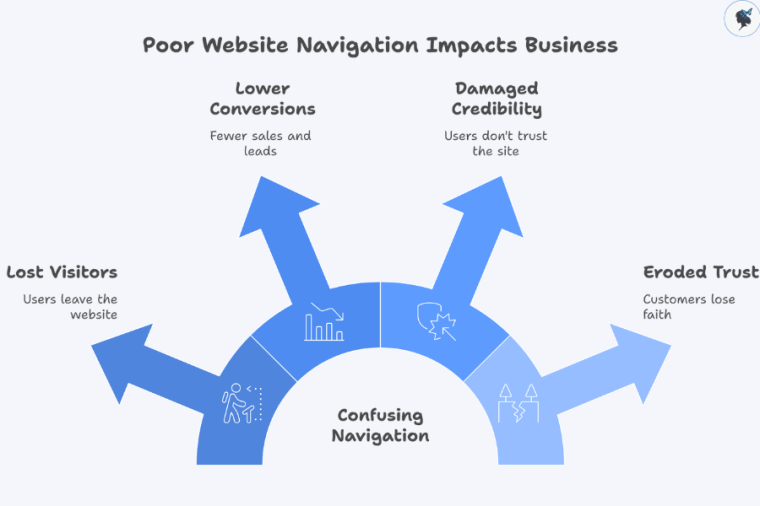
Your website navigation is like the front door of your business—if it’s confusing, cluttered, or hard to use, visitors won’t stick around. In 2026, with users expecting near-instant access to information, poor navigation can directly impact your conversions, credibility, and customer trust.

infograph: Poor website navigation impacts business
Poor website navigation impacts business

Many small businesses unknowingly make common navigation mistakes that frustrate users and drive them away. This article breaks down five of the most frequent issues—and gives you quick, practical fixes you can apply right away.

This guide is designed for small business owners and managers who want to improve their website without needing deep technical expertise. Need help? Contact us today!


Mistake 1: Overly Complicated or Cluttered Navigation Menu

infograph: Simplifying website navigation
Simplifying website navigation

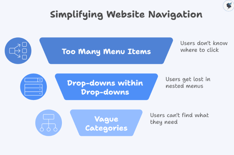
This often looks like:

  • Too many menu items (10+ links in the main navigation)
  • Drop-downs within drop-downs
  • Vague or overlapping categories

Why it’s a problem:

  • Users feel overwhelmed and don’t know where to click
  • Important pages get buried
  • It creates a “messy” and unprofessional impression

Relatable scenario: It’s like walking into a small shop where every product is crammed into the front window—nothing stands out, so customers walk away.

Quick Fixes

  • Limit top-level menu items to 5–7 key pages
  • Prioritize essentials (e.g., Home, Services, About, Contact)
  • Use clear, simple labels (e.g., “Services” instead of “Solutions & Offerings”)
  • Only use mega menus if you truly have a large catalog—and keep them organized

More about optimizing your website navigation here.


Mistake 2: Inconsistent Navigation Placement and Design
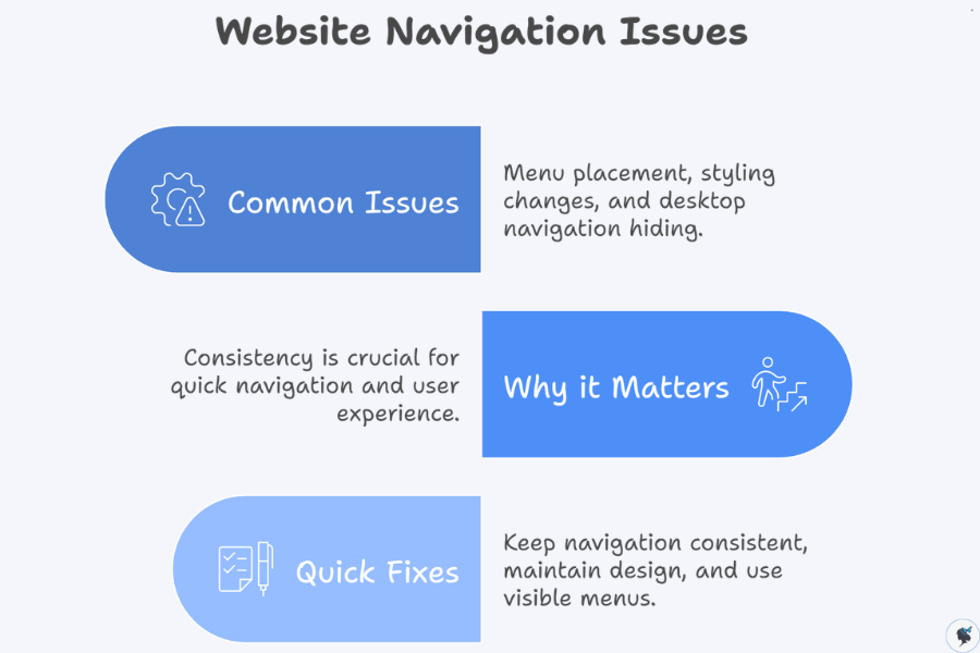
infograph: Website navigation issues
Website navigation issues

Common issues:

  • Menu appears in different places on different pages
  • Styling changes (colors, fonts, spacing)
  • Desktop version hides navigation behind a hamburger icon

Why it matters:

  • Users rely on consistency to navigate quickly
  • Inconsistency creates confusion and frustration

Impact on small businesses: Visitors may lose trust and leave, assuming the site is outdated or unreliable.

Quick Fixes

  • Keep navigation in the same location (typically the top header) across all pages
  • Maintain consistent design (fonts, colors, spacing)
  • Use a visible menu on desktop—reserve hamburger menus for mobile only

Mistake 3: Lack of Clear Calls to Action (CTAs) within Navigation
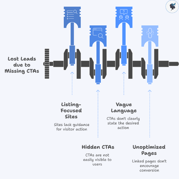
infograph: Lost leads due to missing CTAs
Lost leads due to missing CTAs

Issues:

Many small business sites focus only on listing pages, not guiding action.

Missing or hidden CTAs like:

  • “Contact Us”
  • “Get a Quote”
  • “Book Now”

Why this hurts:

  • Visitors may browse but never convert
  • You lose potential leads and sales

2026 insight: Studies show users decide within seconds whether to take action—your navigation should make that decision easy.

Quick Fixes

  • Add a prominent CTA button in your navigation bar
  • Use action-driven language (e.g., “Get a Free Quote” instead of “Contact”)
  • Make the CTA visually distinct (button style, contrasting color)
  • Link to a focused, conversion-optimized page

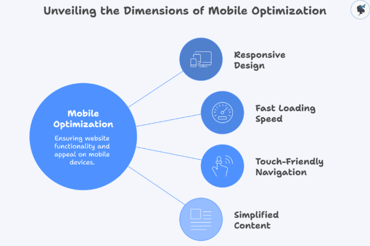
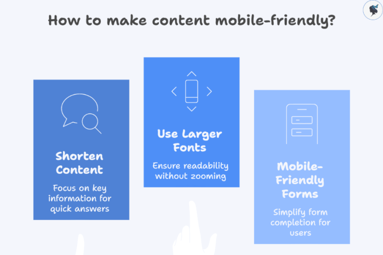
Mistake 4: Ignoring Mobile Responsiveness
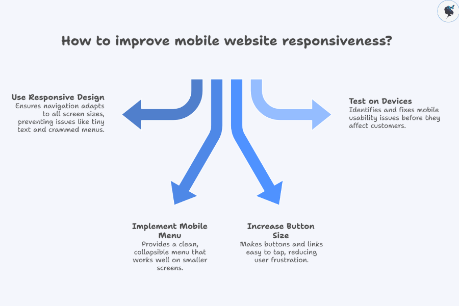
infograph: How to improve mobile website responsiveness?
How to improve mobile website responsiveness?

Common problems:

  • Tiny text or links that are hard to tap
  • Menus that don’t adapt to smaller screens
  • Full desktop navigation crammed onto mobile
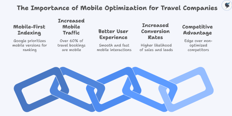
Why it’s critical:

  • In 2026, over 60–70% of small business website traffic comes from mobile devices
  • Poor mobile navigation leads to high bounce rates

Small business impact: You could be losing the majority of your potential customers without realizing it.

Quick Fixes

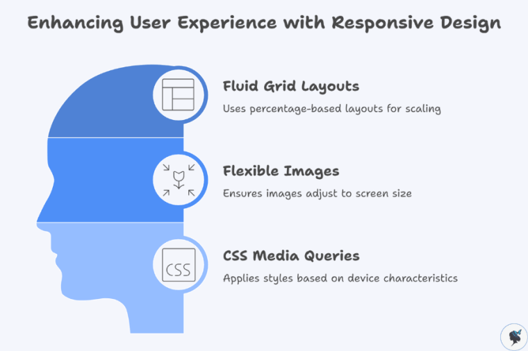
  • Use responsive design so navigation adapts to all screen sizes
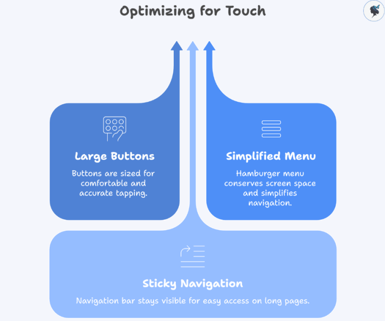
  • Implement a clean, collapsible mobile menu (hamburger menu)
  • Ensure buttons and links are large enough to tap
  • Test your site on multiple devices (phones and tablets)

More about mobile optimization here.


infograph: How to improve link labels on a website?
How to improve link labels on a website?

Problematic labels include:

  • “Resources”
  • “Info”
  • Icons without text

Why this is an issue:

  • Users scan quickly—they don’t want to guess
  • Unclear labels create hesitation and confusion

Small business relevance: If users don’t understand what you offer in seconds, they may leave for a competitor.
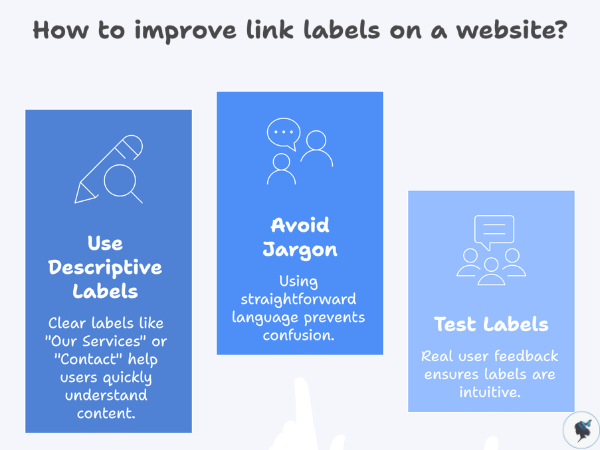
Quick Fixes

  • Use descriptive, straightforward labels:
    • “Our Services”
    • “About Us”
    • “Pricing”
    • “Contact”
  • Avoid internal jargon or clever wording
  • Test your labels with a few real users—ask them what they expect to find

Conclusion

We covered five common navigation mistakes:

  • Cluttered menus
  • Inconsistent design
  • Missing CTAs
  • Poor mobile experience
  • Unclear labels

Why it matters:

Fixing these issues can lead to:

  • Better user experience
  • Higher conversion rates
  • Stronger trust in your brand

Take a few minutes today to review your website navigation—you’ll likely spot at least one of these issues.

Start improving your website’s navigation today—small changes can make a big difference in how customers find and choose your business.

Mobile Optimization for Travel Companies


▶ Table of Contents
  1. What is Mobile Optimization?
  2. How to Mobile Optimize Your Travel Website
  3. Why Mobile Optimization is Critical for Travel Companies

In today’s digital age, mobile optimization is no longer optional—it’s a necessity. For travel companies, especially those in the tourism and hospitality industries, having a mobile-optimized website is vital for delivering an exceptional user experience and maximizing conversions. Whether your customers are searching for flight options, browsing vacation packages, or booking accommodations, chances are they are using their mobile devices to do so.

In this article, we will dive deep into what mobile optimization is, why it is essential for travel businesses, and how to implement the best mobile practices for your site.


What is Mobile Optimization?

Mobile optimization refers to the process of ensuring that your website is fully functional, fast, and visually appealing on mobile devices such as smartphones and tablets. This includes designing a responsive layout, improving load times, and ensuring that the content and features of the site are tailored to the needs of mobile users.

infograph: Unveiling the dimensions of mobile optimization
Unveiling the dimensions of mobile optimization

Key Elements of Mobile Optimization:

  • Responsive Design: A mobile-optimized website automatically adjusts its layout to fit the screen size of the device it’s being viewed on. Whether a user accesses your website on a desktop, tablet, or phone, the content should resize and adjust to provide a seamless experience.
  • Fast Loading Speed: Mobile users often have limited bandwidth, so optimizing your site for fast loading times is crucial. Pages should load within a couple of seconds to prevent users from abandoning the site.
  • Touch-Friendly Navigation: Since mobile users interact with websites through touchscreens, your site should have large buttons, intuitive menus, and easy-to-click links to enhance usability.
  • Simplified Content: On smaller screens, content should be concise and easy to read. Long blocks of text should be broken up with visuals, and calls to action (CTAs) should be easy to find.

With the majority of travelers using mobile devices to book flights, hotel rooms, or experiences, mobile optimization ensures that you’re catering to this audience while maintaining a smooth and accessible experience.


How to Mobile Optimize Your Travel Website

Now that you understand what mobile optimization is, let’s explore the key steps you can take to ensure that your website performs well on mobile devices.

Implement Responsive Web Design

Responsive web design is the backbone of mobile optimization. It ensures that your website automatically adjusts its layout, images, and navigation based on the screen size and device type.

infograph: Enhancing user experience with responsive design
Enhancing user experience with responsive design

How to Implement:

  • Use Fluid Grid Layouts: Use percentage-based layouts instead of fixed-width ones. This allows your site elements to scale and adjust to the screen size.
  • Flexible Images: Make sure images are sized properly to scale down on smaller devices. Use responsive image techniques, such as the srcset attribute, to provide different image resolutions based on the user’s device.
  • CSS Media Queries: Implement media queries in your CSS to apply different styles based on the device’s screen size, orientation, and resolution.

This way, your website will always look great and function properly regardless of the device it’s being viewed on.

Optimize Website Speed for Mobile

Speed is one of the most important factors when it comes to mobile optimization. Mobile users expect websites to load quickly, and Google even uses page speed as a ranking factor. A slow website can lead to higher bounce rates and fewer conversions, which is especially harmful for travel companies where timely and engaging content is critical.

infograph: Strategies for mobile website speed optimization
Strategies for mobile website speed optimization

How to Optimize Speed:

  • Compress Images: Use image compression tools (e.g., TinyPNG or ImageOptim) to reduce file size without compromising quality.
  • Minify JavaScript and CSS: Minify your site’s CSS, JavaScript, and HTML to reduce unnecessary code and improve page load times.
  • Enable Browser Caching: Configure your server to cache resources so that repeat visitors load pages faster.
  • Use a Content Delivery Network (CDN): Implement a CDN to serve static assets like images and scripts from servers closest to the user, reducing load times and latency.

Optimize Navigation for Touch

Mobile users interact with websites using touchscreens, so your navigation should be adapted for touch. Buttons, menus, and links should be large enough to tap comfortably, and the layout should be simple to help users navigate quickly.

infograph: Optimizing for touch
Optimizing for touch

How to Optimize Navigation:

  • Large, Clickable Buttons: Buttons should be large enough for users to tap easily. Avoid small clickable elements, as they are difficult to interact with on mobile devices.
  • Simplify the Menu: Use a hamburger menu (three horizontal lines) to condense the navigation into a dropdown, saving valuable screen space.
  • Sticky Navigation: For longer pages, consider a sticky navigation bar that remains visible as users scroll down.

Make Content Mobile-Friendly

Mobile screens are much smaller than desktops, so you need to ensure that your content is easy to read and interact with. Long-form text should be broken up with images and bullet points, and calls-to-action (CTAs) should be easily tappable.

infograph: How to make content mobile-friendly?
How to make content mobile-friendly?

How to Optimize Content:

  • Shorten and Prioritize Content: Mobile users want quick answers. Focus on making your content concise and to the point. Prioritize key information that travelers will want first (e.g., availability, prices, contact information).
  • Use Larger Fonts: Ensure that text is large enough to be easily read on mobile screens without zooming.
  • Mobile-Friendly Forms: Travel companies often rely on forms for bookings and inquiries. Make sure forms are simple to complete on mobile, with input fields that are easy to tap and autocomplete wherever possible.

Test Your Mobile Site Regularly

After implementing mobile optimization strategies, you should regularly test your website to ensure it works properly across different devices and screen sizes.

How to Test Mobile Optimization:

  • Browser Testing: Test your website across a range of browsers and devices to identify issues related to specific platforms (i.e., Safari vs. Chrome, iOS vs. Android).
  • Real-World User Testing: Ask real users to interact with your website on their mobile devices and provide feedback about usability and speed.

Why Mobile Optimization is Critical for Travel Companies

infograph: The importance of mobile optimization for travel companies
The importance of mobile optimization for travel companies

Mobile-First Indexing

Google has adopted mobile-first indexing, which means it primarily uses the mobile version of your website to rank and index content. If your website isn’t mobile-optimized, it will hurt your SEO rankings, making it harder for potential travelers to find your business online.

Increased Mobile Traffic

As of recent reports, over 60% of online travel bookings are made via mobile devices. Travelers are increasingly relying on their phones to research and book trips, compare prices, and read reviews. If your website is not mobile-friendly, you’re missing out on a significant portion of potential customers.

Better User Experience

When it comes to travel, users want to quickly find information and book their trips without any hassle. A smooth, fast mobile experience is essential to keep users engaged. Mobile optimization enhances the overall user experience and helps maintain customer loyalty.

Increased Conversion Rates

A mobile-optimized site is more likely to convert visitors into customers. From booking flights to reserving hotels or tours, a smooth, mobile-friendly process increases the likelihood of a sale or lead generation.

Competitive Advantage

Many travel companies are still not fully optimized for mobile. By ensuring your site is mobile-friendly, you can gain a competitive edge over businesses that have neglected mobile optimization.

Ready to Optimize Your Website for Mobile? Contact Wander Women Strategies today!