
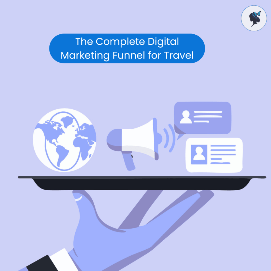
The Complete Digital Marketing Funnel for Travel
▶ Table of Contents
- The Complete Digital Marketing Funnel for Travel
- Introduction
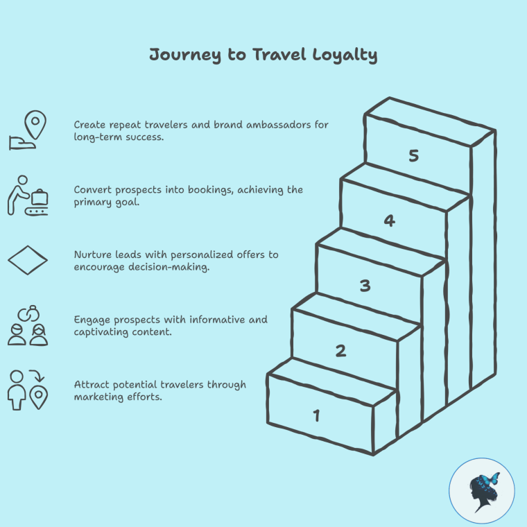
- 1. Awareness Stage: Attracting Potential Travelers
- 2. Interest Stage: Engaging & Educating Prospects
- 3. Consideration Stage: Nurturing Leads with Personalized Offers
- 4. Conversion Stage: Turning Prospects into Bookings
- 5. Loyalty & Advocacy Stage: Creating Repeat Travelers & Brand Ambassadors
- 6. Tools & Technology to Support the Funnel
- 7. Case Studies / Examples
- Conclusion
Introduction
In today’s highly competitive travel industry, simply having a website or social media presence isn’t enough. Travel brands need a structured, strategic approach to guide potential travelers from discovering your offerings to becoming loyal customers. This is where a digital marketing funnel becomes essential. It helps you attract, engage, convert, and retain customers by delivering the right message at the right time.
According to HubSpot, companies that adopt a structured inbound funnel see a 55% increase in leads and higher conversion rates. For travel businesses, where purchase decisions can be complex and expensive, funnel marketing ensures no prospect gets left behind.
1. Awareness Stage: Attracting Potential Travelers
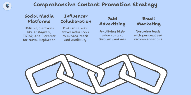
The first stage is all about visibility—making sure your travel brand is discovered by people dreaming about their next getaway. Key channels include SEO, social media ads, content marketing, and influencer partnerships.
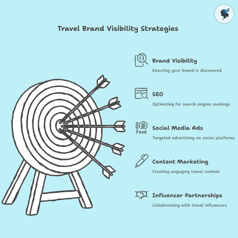
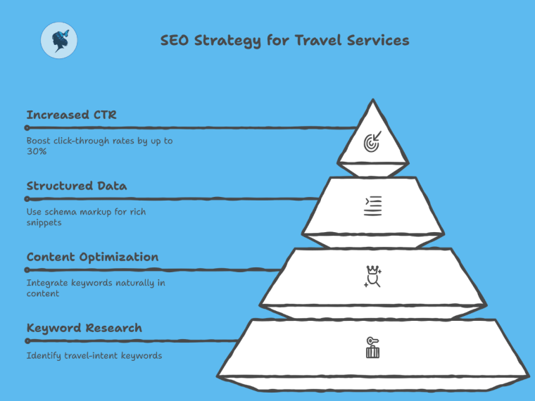
- SEO: Travel-related search volume continues to grow; Google Trends shows that keywords like “best beach vacations” and “affordable trips 2025” spike seasonally, offering great opportunities.
- Social Media: Platforms like Instagram and TikTok are where 80-90% of Gen Z and Millennials discover travel inspiration.
- Influencers: Partnering with travel influencers can increase brand reach.
Metrics to track: reach, impressions, and website visits.
Read our post: Marketing to Gen Z travelers.
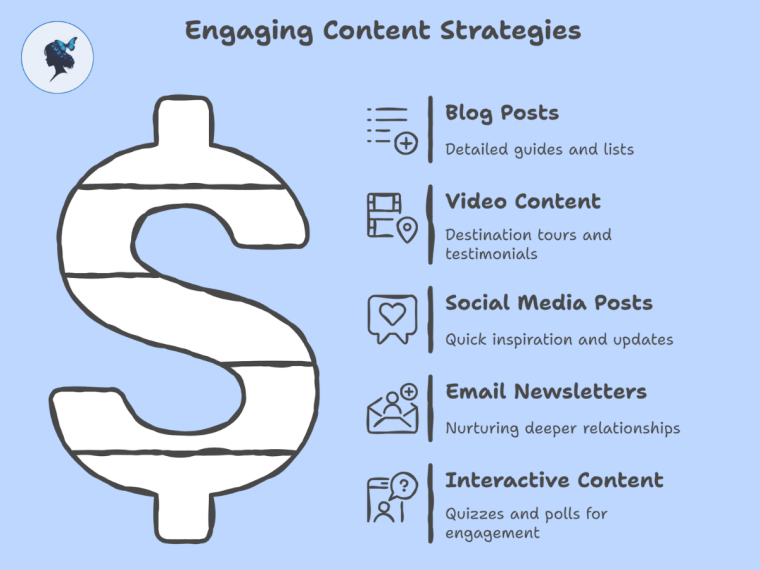
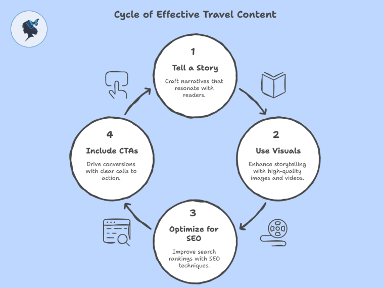
2. Interest Stage: Engaging & Educating Prospects
Once you have their attention, it’s important to deepen interest by providing valuable, informative content that helps prospects envision their trip and builds trust.
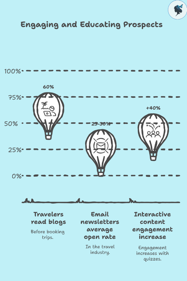
- Use engaging blog posts on destinations, travel tips, and insider guides. 60% of travelers read blogs before booking trips.
- Email newsletters with personalized tips see an average open rate of 25-30% in the travel industry.
- Interactive content like quizzes (“What’s your travel style?”) increases engagement by over 40%.
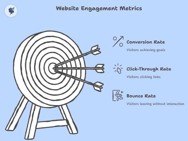
Metrics to track: time on site, bounce rate, email open and click-through rates.
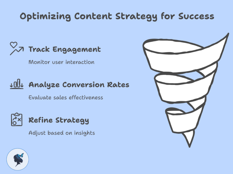
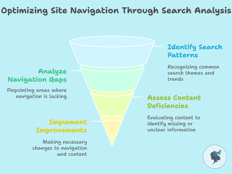
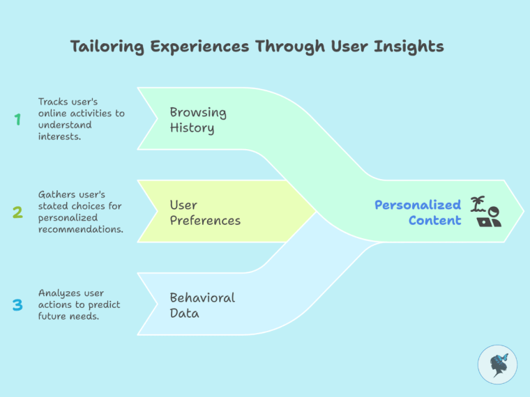
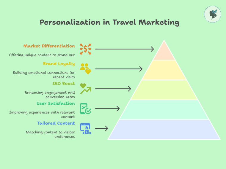
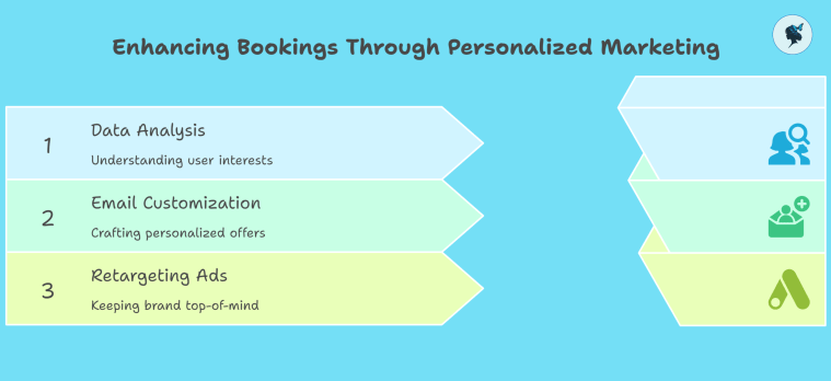
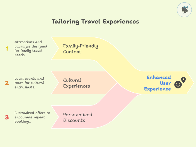
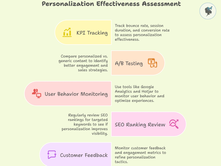
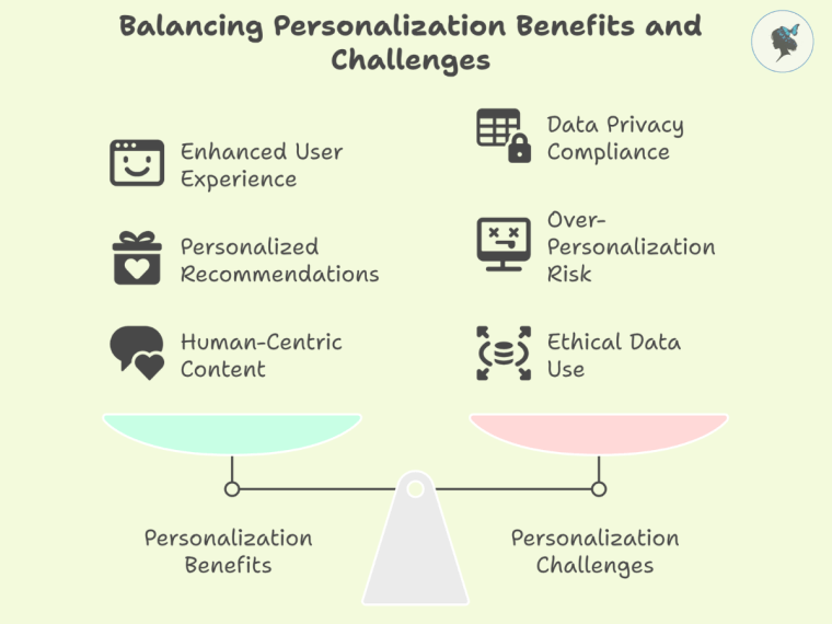
3. Consideration Stage: Nurturing Leads with Personalized Offers
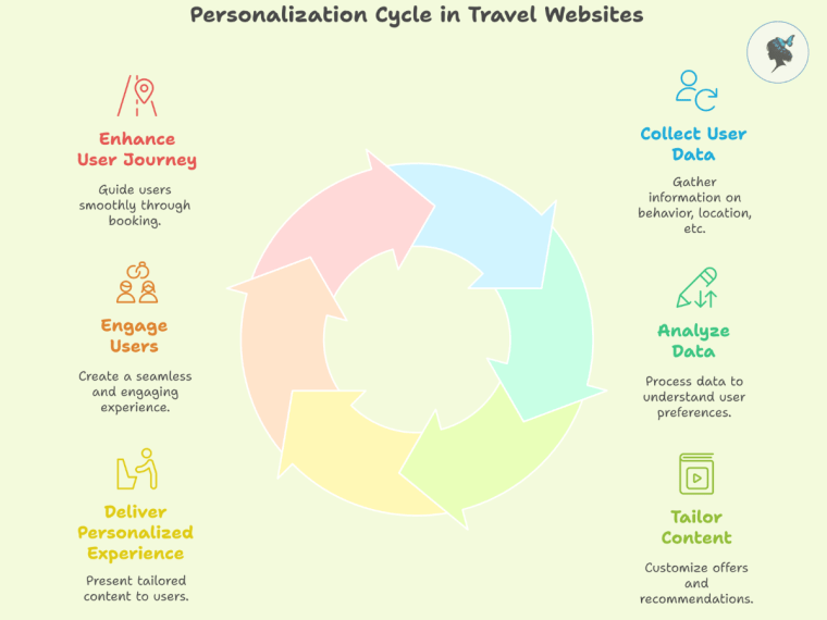
At this point, your prospects are weighing options. Personalized nurturing is key to tipping the scale in your favor.
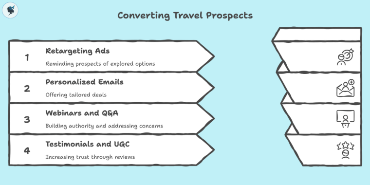
- Retargeting ads reminding visitors of destinations or packages they explored can increase conversions by 70%.
- Email sequences offering special deals tailored to user behavior have an average conversion rate of 18%.
- Hosting webinars or live Q&A sessions builds authority and addresses concerns directly—The attendance rate for B2B travel webinars is 55%.
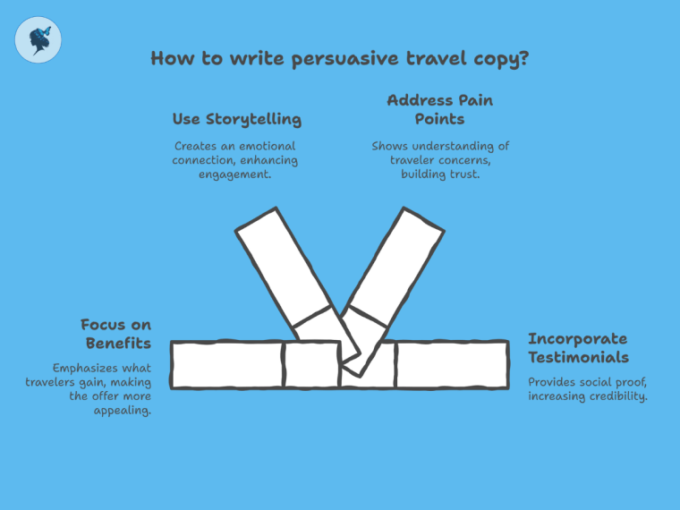
- Featuring testimonials and user-generated content (UGC) increases trust, with 79% of travelers saying they trust reviews as much as personal recommendations.
Metrics: click-through rates (CTR), engagement with personalized offers, webinar attendance.
Read our post: the importance of personalization.
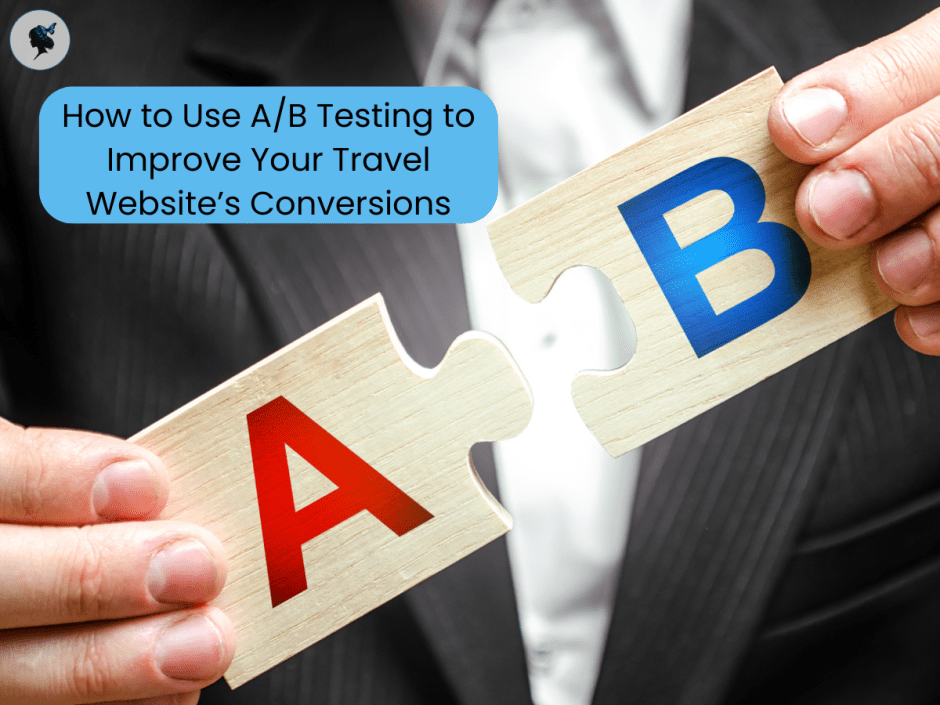
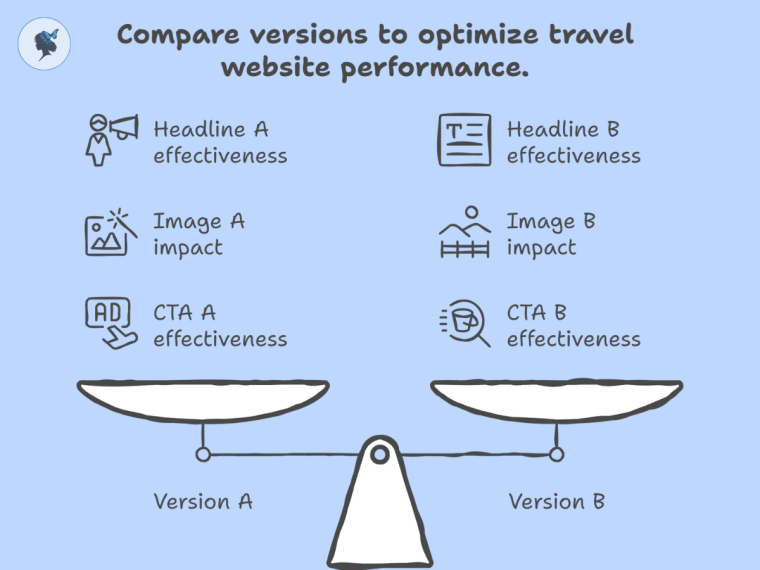
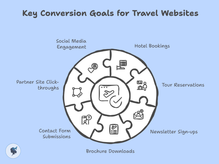
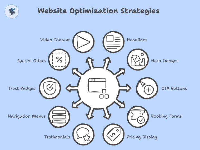
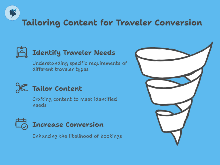
4. Conversion Stage: Turning Prospects into Bookings
This is the critical phase where interest turns into action—your prospect becomes a customer.
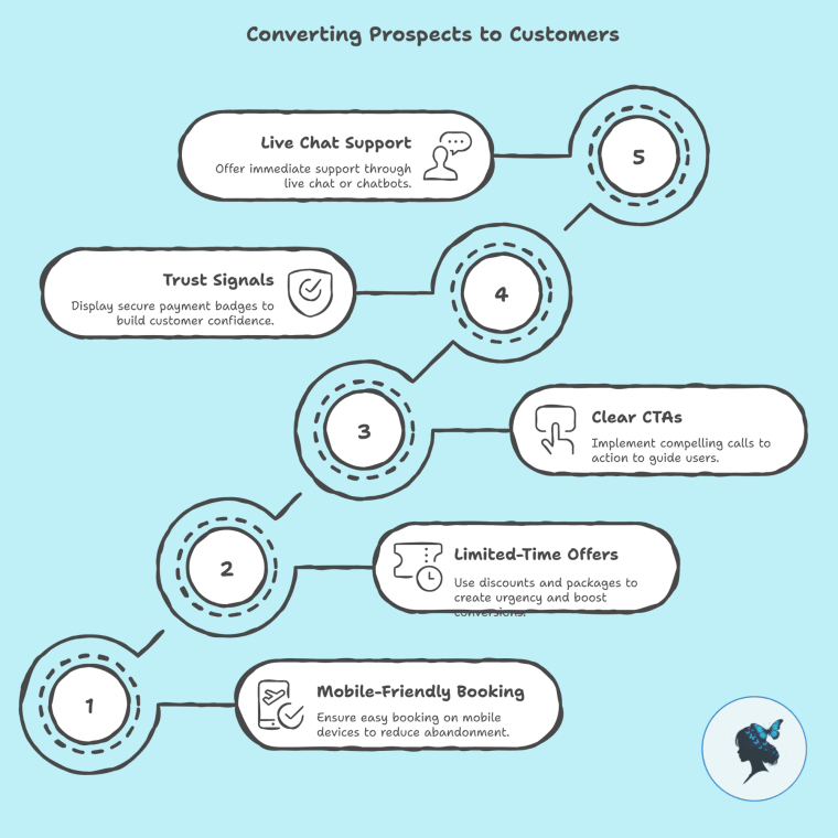
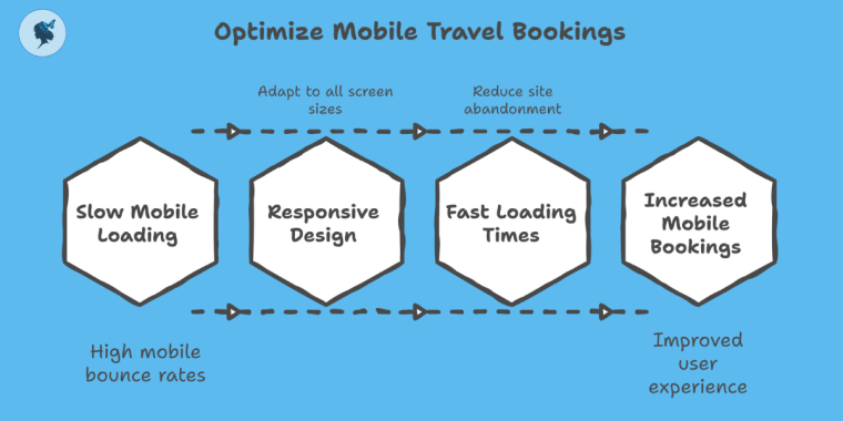
- Simplified, mobile-friendly booking processes reduce cart abandonment; mobile apps account for 60% of travel bookings.
- Limited-time discounts or exclusive packages create urgency and can boost conversions by up to 35%.
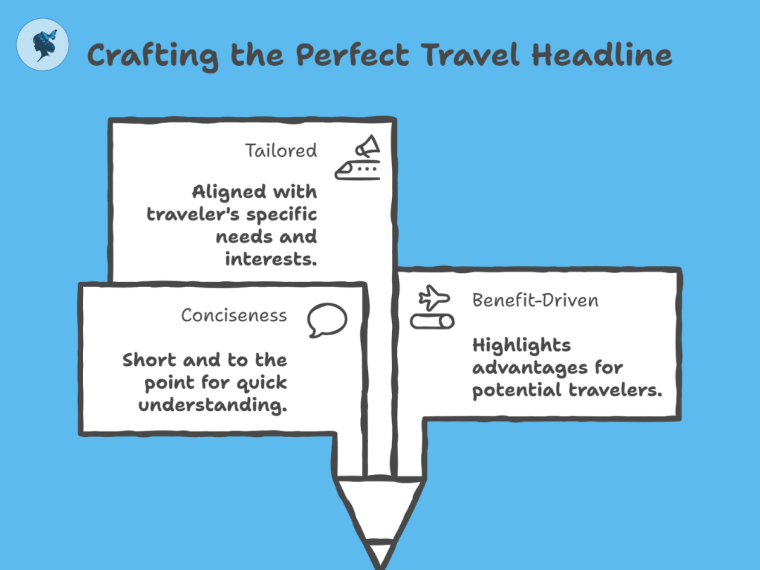
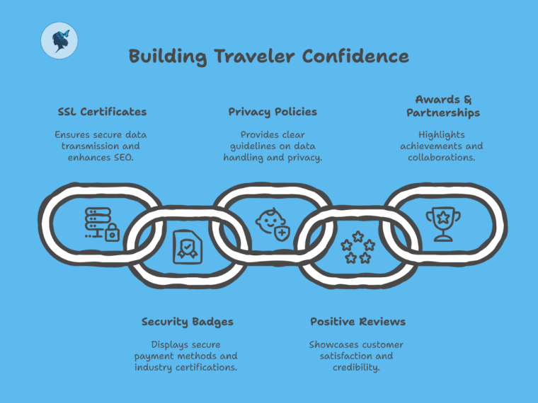
- Clear, compelling calls to action (CTAs) and trust signals like secure payment badges improve customer confidence.
- Offering live chat or chatbots delivers immediate support; 53% of online shoppers prefer using live chat for quick answers.
Metrics: booking conversion rate, cart abandonment rate, average booking value.
More about trust signals here.
5. Loyalty & Advocacy Stage: Creating Repeat Travelers & Brand Ambassadors
Repeat customers are the backbone of sustainable travel businesses. Turning travelers into loyal advocates drives ongoing revenue and new customer referrals.
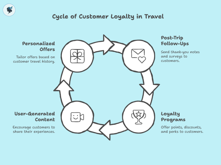
- Sending post-trip follow-ups with thank-you notes and surveys increases repeat bookings by 20-25%.
- Implementing loyalty programs with points, discounts, and perks leads to 30% higher customer retention.
- Encouraging user-generated content and reviews boosts brand credibility; UGC campaigns see 4x higher engagement on social media.
- Personalized offers based on travel history increase upsell success by 10%.
Metrics: repeat booking rate, referral rates, Net Promoter Score (NPS).
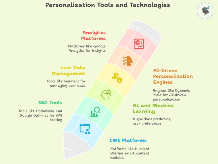
6. Tools & Technology to Support the Funnel
- CRM software (e.g., Salesforce, HubSpot) for managing leads and customer data.
- Marketing automation platforms for email and retargeting campaigns.
- Analytics tools (Google Analytics, Facebook Insights) to measure funnel performance.
- AI chatbots to provide 24/7 customer support and personalized recommendations.
Investing in the right tools can improve efficiency and ROI by up to 30%.
7. Case Studies / Examples
- Expedia’s Retargeting Strategy: Personalized retargeting ads based on search behavior led to a 70% lift in conversion rates.
- Trafalgar’s Loyalty Program: Personalized post-trip offers and rewards contributed to 25% repeat customer growth.
Conclusion
A well-structured digital marketing funnel is critical for travel brands aiming to grow in a competitive market. From awareness through loyalty, each stage requires tailored strategies, relevant content, and smart technology. By measuring key metrics and optimizing at every step, you can turn casual browsers into passionate travelers who come back year after year.
Ready to implement a winning digital marketing funnel? Contact us for a tailored audit, strategy plan, or content calendar designed specifically for your travel brand.


